
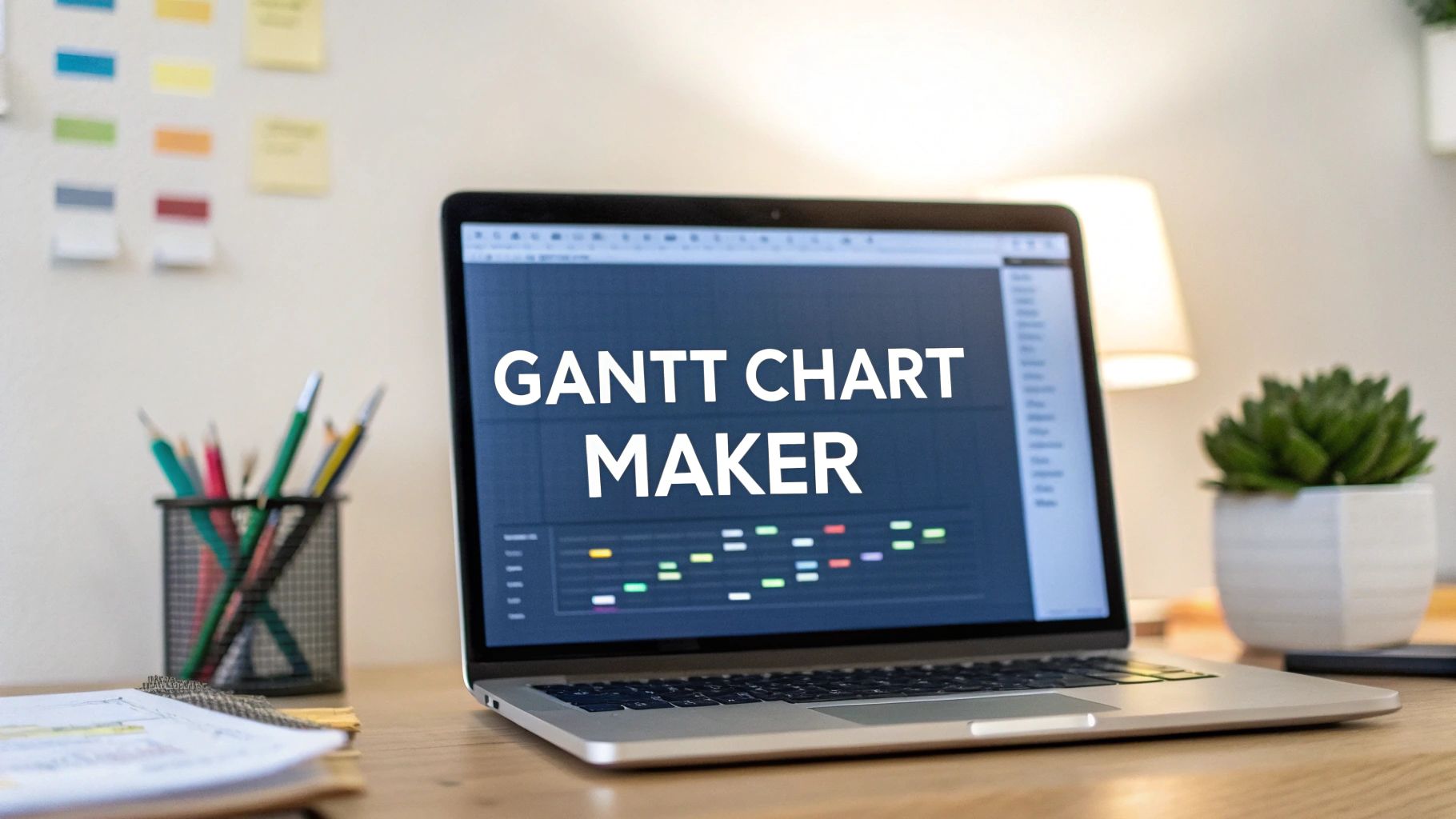
A Gantt chart maker is a tool that turns a project plan into a clear, visual timeline. It shows what needs to be done, who is doing it, and how each task connects to the others.
Think of it as a roadmap for a complex project. It’s a significant improvement over a static spreadsheet because it gives everyone a shared, dynamic picture of the work ahead.
Why a Gantt chart maker is necessary

A Gantt chart maker answers three project questions: what needs doing, when does it need to be done, and who is responsible for it? It lays out every task along a timeline, making the entire schedule easy to understand at a glance.
Modern tools do more than draw bars on a calendar. They transform a static document into a living system. When one task gets delayed, a good Gantt chart maker shows the ripple effect on everything else. This helps you spot problems and adjust the plan before a small issue becomes a major delay.
From Vague Plans to Actionable Timelines
Without a visual tool, project plans are often scattered. You might have a task list in a spreadsheet, deadlines on a shared calendar, and resource assignments in an email chain. This fragmentation makes it difficult to see the full picture.
A Gantt chart maker consolidates that information into a single view. This central source of truth ensures everyone, from the team members to stakeholders, is aligned. That clarity reduces miscommunication and helps the team move in the same direction. Our guide on creating Gantt charts online has more information.
Core Components of a Gantt Chart
Every Gantt chart maker is built on a few core components. These are the building blocks that visualize a project's structure and progress.
Here is a quick summary of the features that turn a timeline into a project management tool.
Core Components of a Gantt Chart Maker
| Component | Function |
|---|---|
| Tasks | The individual jobs or activities that need to be finished. |
| Timeline | The horizontal axis showing the project's timeframe, usually in days, weeks, or months. |
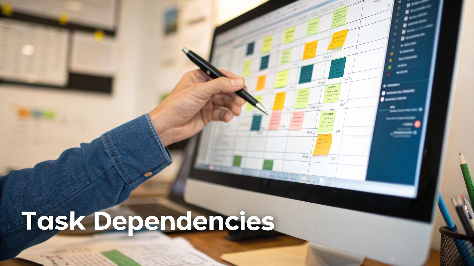
| Dependencies | Links between tasks, showing which ones must be completed before others can start. |
| Milestones | Key checkpoints or deadlines, like a product launch or the end of a major phase. |
| Progress | A visual cue, often a shaded bar, showing how much of a task has been completed. |
These elements make Gantt charts effective. They provide a clear, shared language for discussing the project's status.
Key Features to Look For in a Gantt Chart Maker
Not all Gantt chart makers are the same. A basic tool might let you draw a simple timeline, but a professional one has features that help manage project complexity. Knowing these features is the first step toward picking a tool that fits your team’s workflow.
The most important feature is task dependencies. This turns a list of tasks into a logical project plan. It lets you link tasks together, showing that one task cannot start until another is finished.
For example, the "Develop Front-End" task cannot begin until the "Finish UI Mockups" task is complete. A good Gantt chart maker visualizes these links. If the design work is delayed, the effect on the development schedule is instantly clear to everyone.
Managing Resources and Spotting Risks
A plan is useless without the people to execute it. This is where resource allocation is important. This feature lets you assign specific team members to tasks, giving you an overview of who is working on what, and when.
For example, a DevOps lead needs to assign two senior engineers to a critical bug fix. The Gantt chart shows their current workload, making sure they are not pulled from other sprint tasks and preventing burnout. This visibility is the foundation of realistic planning. In the Netherlands, this capability is a reason for the tool's popularity. A survey showed 68% of Dutch IT organizations use digital Gantt tools to manage deployments, an increase from 42% in 2020.
Another useful feature is critical path analysis. The critical path is the longest chain of dependent tasks that determines the shortest possible project duration.
A delay in any single task on the critical path will delay the entire project. A professional Gantt chart maker automatically highlights this path for you, showing you exactly which tasks need the most attention.
Tracking Progress and Keeping Communication Clear
How do you know if you're on track? Baseline tracking provides the answer. When you finalize your initial plan, you can save it as a "baseline." As the project progresses and schedules change, the tool compares your current timeline against the original plan. This gives you a clear visual record of delays and scope creep, which is valuable for project reviews.
Modern Gantt chart makers also include collaboration tools. Features like task-specific comments and file attachments keep every conversation in the right place. Instead of searching through emails for feedback on a design, the discussion is attached directly to the "Review Design Mockup" task. This keeps communication contextual and actionable. For more on this, check out our guide on the best software for planning.
How to Choose the Right Gantt Chart Maker
Picking a Gantt chart maker is not just about checking boxes on a feature list. The right tool has to fit your team's size, the type of projects you run, and the software you already use. If you choose poorly, you'll have low adoption and a wasted subscription.
Start by being honest about your team's situation. A small team launching a single product might be fine with a lightweight, standalone tool. It’s quick to set up and avoids unnecessary features.
For a large organization managing multiple projects, an integrated, enterprise-level solution is more appropriate. These platforms typically have advanced reporting and security features required by larger companies.
Evaluate Team Size and Project Complexity
The scale of your operation is the first filter. A five-person startup and a 500-person enterprise have different needs. A tool that helps one will frustrate the other.
Ask yourself these questions:
- How many people will use this tool? Some tools charge per user, which can become expensive.
- What is the average complexity of our projects? Are you managing simple checklists or complex projects with hundreds of dependencies?
- How steep is the learning curve? A powerful tool is useless if your team cannot figure it out without extensive training. Adoption is everything.
Take this chart, for example. It shows a project with multiple phases and clear dependencies.
A tool that can visualize these connections is necessary for complex work. For a simple marketing campaign, it would be overkill.
Check for Critical Integrations
A Gantt chart maker cannot operate in isolation. It needs to work with the other tools your team uses. When software does not connect, it creates friction and requires manual data entry.
Before committing, list your team's essential software and check for compatibility. Key integration questions include:
- Does this tool integrate with our version control system (like Git)?
- Can it sync with our communication platform (like Slack or Teams)?
- Will it pull data from our existing task management software (like Jira)?
A Gantt chart maker that doesn’t integrate with your core workflow will quickly become another abandoned subscription. The goal is to centralize information, not create another data silo.
Getting any new tool adopted depends on how well it is implemented. For some platforms, you might consider getting specialized help, like the monday.com implementation services available for more complex rollouts. Thinking about your implementation strategy from the start will save you problems later. Choosing a tool that fits into your current processes is the most reliable path.
Connecting Your Gantt Chart Maker With Analytics
A project plan is a hypothesis. It's a guess about how work will unfold. Without real data, it remains guesswork. Connecting your Gantt chart maker to an analytics platform provides the feedback needed to turn guesses into evidence-based plans.
This integration lets you compare the planned work on your Gantt chart against how things actually get done. The goal is to build timelines that reflect reality, not wishful thinking.
This concept map breaks down the key decision points—team size, project complexity, and necessary integrations—you’ll face when choosing a tool.
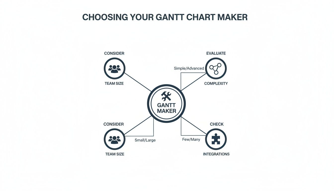
As the diagram shows, the right tool depends on your specific operational needs, not just a generic feature list.
From Estimates to Evidence
Consider a common scenario. Your Gantt chart allocates 40 hours for a developer to complete a new feature. On paper, that seems reasonable. But what if that developer is frequently pulled into meetings or spends half their day switching between different applications?
An analytics tool like WhatPulse can offer objective, privacy-first data on application usage. It can show if those 40 hours were spent productively in an IDE, or if they were fragmented across chat apps and other distractions. This is not about surveillance; it's about spotting hidden bottlenecks that are disrupting your timeline.
This data provides a reality check.
- Identify Workflow Friction: See where team members lose focus due to excessive meetings or constant tool-switching.
- Validate Time Estimates: Confirm if the time allocated for tasks is realistic, based on actual work patterns.
- Adjust Plans Proactively: Modify your Gantt chart based on quantitative insights, not gut feelings.
This approach helps managers support their teams by removing systemic obstacles to focused work. Our guide on tracking time spent on projects explores this concept in more detail.
A Practical Feedback Loop
This integration creates a continuous improvement cycle for your project management. The Gantt chart sets the plan, and the analytics data measures the reality. The insights from that data then feed back into refining the next version of your plan.
For instance, a Gartner report found that Dutch engineering and product team leads in the NL region reduced project bottlenecks by 34% using this method. The report also noted that 72% of the firms they surveyed integrated their Gantt chart maker with privacy-first analytics to monitor activity and adoption trends, validating their project plans with hard data. You can dig into these Gantt chart findings on deltek.com.
By connecting your planning tool to real-world usage data, you move from reactive problem-solving to proactive optimization. You can spot a potential delay weeks in advance because the data shows a task is taking longer than anyone realized.
This connection makes your Gantt chart maker a more strategic tool. It stops being a static document and becomes a dynamic system that learns and adapts, helping you deliver projects more predictably.
Measuring the Real Impact of Your Project Timelines
A Gantt chart is more than a timeline. It’s a source of business intelligence that can prove its value in terms your finance and operations teams understand: numbers on cost savings, efficiency gains, and risk reduction.
The key is to connect your project plan to measurable business outcomes. Instead of just claiming “better planning,” you can present hard evidence. This is how a Gantt chart maker stops being a project management expense and becomes a strategic asset.
Correlating Timelines with Software Utilization
One way to measure impact is to track software license usage against your project timeline.
Imagine your Gantt chart schedules a three-month development phase for ten engineers. They all need access to a specialized coding tool. The plan seems solid. But what if only six of those licenses are ever used?
By connecting your Gantt chart schedule to an analytics platform that tracks application usage, you can spot this over-provisioning. This is not about micromanaging people; it’s about aligning resources with what the project actually needs.
This approach gives you concrete numbers for procurement. For NL finance and procurement teams, linking a Gantt chart maker to tools like WhatPulse Professional has led to a 29% reduction in software license waste. A KPMG Netherlands study on endpoint analytics found that 77% of CIOs in the Randstad area were using these visuals to track software adoption against project budgets. You can read more about these Gantt chart findings on TechRepublic.
Using Baselines to Measure Policy Impact
A Gantt chart’s baseline feature is a tool for measuring the effect of new work policies. A baseline is a snapshot of your original project plan, a control for your experiment.
Let's say your company introduces a "no-meeting Wednesdays" policy to create more time for deep work. Before the policy begins, you save the project's current timeline as a baseline. A few weeks later, you compare your actual progress against that original snapshot.
Are tasks on the critical path being completed faster? Has the overall project velocity improved? The Gantt chart provides a clear visual comparison, showing whether the new policy is helping or hindering progress.
This method turns a subjective debate about company culture into a data-driven discussion. You can show that a specific change led to a measurable improvement in project delivery speed.
Quantifying Efficiency for Operations Teams
Operations teams focus on process efficiency. A Gantt chart can provide the data they need to find and quantify bottlenecks. By analyzing multiple project timelines together, you can spot recurring patterns.
For example, you might notice that the "QA Testing" phase is consistently a week late across all software projects. That is a process issue. With this data, you can investigate the root cause.
- Is the QA team understaffed?
- Are developers submitting code late for testing?
- Is the testing environment unreliable?
The Gantt chart highlights the problem and shows the effect on every deadline. This gives the operations team a mandate to fix the issue, backed by evidence of delays and their costs. It is the kind of proof that justifies investments in new tools, more staff, or a process redesign.
A Few Common Questions About Gantt Chart Makers
When you start looking into Gantt chart makers, a few questions often come up. These tools can seem complicated at first, but once you understand a couple of key ideas, picking the right one becomes easier.
Here are some practical answers.
Can You Use a Gantt Chart Maker for Agile Projects?
Yes. While Gantt charts have a reputation for being rigid and associated with Waterfall project management, many modern tools are flexible and work well in Agile or hybrid setups.
In an Agile environment, a Gantt chart can serve as a high-level roadmap. It’s useful for visualizing sprint timelines and showing how different sprints depend on one another. This gives stakeholders a clear view of the bigger picture without getting lost in the backlog details.
What’s the Difference Between a Gantt Chart and a Project Timeline?
A project timeline is basic. It is a chronological list of tasks showing what happens and in what order. It's a useful visual, but its capabilities end there.
A Gantt chart is more powerful. It does everything a timeline does but adds layers of detail that clarify the project:
- Task Dependencies: It shows the relationships between tasks, so you know which activities must be finished before others can start.
- Resource Allocation: You can see who is assigned to each task. This helps manage team workloads and spot potential bottlenecks.
- The Critical Path: A good Gantt chart will highlight the sequence of tasks that dictates your final deadline. It tells you where to focus to keep the project on track.
In short, a timeline shows you the schedule. A Gantt chart shows you the project's entire structural logic.
How Much Should a Good Gantt Chart Maker Cost?
The price of a Gantt chart maker can vary. You can find free or cheap options that are fine for simple timelines, small projects, or solo use. For basic scheduling, they work.
But if you need a professional tool with more features, you will need a subscription.
For a Gantt chart maker that includes resource management, baseline tracking, detailed reporting, and integrations with other tools, expect to pay between €10 to €50 per user, per month. The final cost will depend on the vendor, the feature set, and the number of people on your team.
A great Gantt chart maker is just one piece of the puzzle. To truly know if your project is healthy, you need to connect your plan to what’s actually happening on the ground. See how WhatPulse gives you the privacy-first analytics to validate your timelines and fine-tune your workflow at https://whatpulse.pro.
Start a free trial