
The Mac's built-in time viewer, Screen Time, gives you a small piece of the puzzle. It tracks "screen on" time, but that metric is misleading for work. It can't tell the difference between someone actively working and an application sitting open in the background.
For business decisions, you need granular data. This is where dedicated analytics platforms come in.
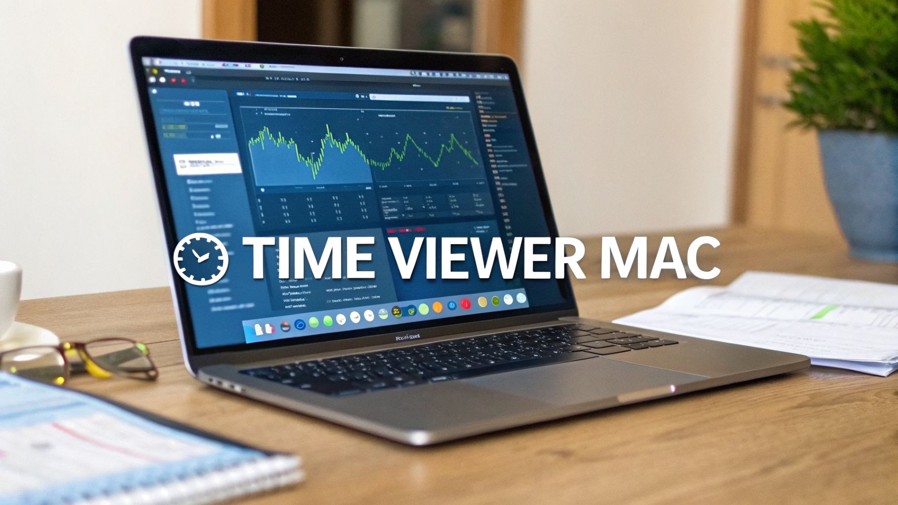
Why Built-In Mac Tools Don't Cut It

If you look for a time viewer on your Mac, you'll find two native tools: Screen Time and Activity Monitor. Both offer a surface-level view of what’s happening, but their limits are obvious in a professional context.
Screen Time lumps everything into broad, vague categories, making it impossible to separate work from idle distractions. Activity Monitor is great for killing a rogue process that's eating your CPU, but it offers zero insight into historical usage patterns.
The "Screen On" Time Fallacy
The problem with these default tools is their focus on "screen on" time. It’s a flawed metric for measuring productivity or how company resources are used. It treats an hour spent writing code in an IDE the same as an hour with a forgotten web browser open in the background.
This lack of context creates a blind spot for anyone in IT, operations, or team leadership. You're left guessing on business questions:
- Is our new design software actually getting used, or was it a wasted investment?
- How much time does our engineering team spend in their development environment versus in meetings?
- Are people adopting the new project management tool we rolled out last quarter?
Answering these questions requires data that goes beyond simple uptime.
The Need for Granular, Actionable Data
A professional-grade time viewer for Mac needs to deliver data that informs decisions. This means tracking active application focus time, not just what apps are running. It should aggregate this data to reveal trends—without compromising individual privacy—to help managers optimize workflows and software spending.
This isn't a niche concern. In the Netherlands, where hybrid work is common, the demand for productivity software is growing. Revenue is projected to hit €450 million by 2026, a trend driven by over a million small and medium-sized enterprises integrating smarter digital tools. You can explore this trend further in the Statista Market Insights report. This growth isn't just about tracking; it's about realizing that basic tools are not sufficient for modern work.
The goal isn’t to monitor individuals. It's to understand how work happens across the organization. The right data can reveal friction in your workflows, highlight underutilized software, and provide justification for technology investments.
Without this level of detail, you're flying blind. You might renew a software license for a hundred users when only ten people actively use it. Or you might miss an opportunity to provide training for a tool that your teams are struggling with.
The default Mac tools were designed for personal awareness, not for business management. They weren’t built for the job.
Comparing Mac Time Viewing Tools
Here is a breakdown of how the built-in tools stack up against a professional platform designed for business use.
| Feature | macOS Screen Time | Activity Monitor | WhatPulse Professional |
|---|---|---|---|
| Data Granularity | Broad categories (e.g., "Social") | Real-time CPU/memory use only | Tracks active focus time per application, keystrokes, and clicks for deep insights. |
| Historical Reporting | Limited to weekly summaries | None; only shows current activity | Unlimited, customizable historical data for long-term trend analysis. |
| Team Management | Not designed for teams | Not applicable | Centralized dashboards for organization-wide analytics and software usage. |
| Privacy Controls | User-centric, not business-managed | Not applicable | GDPR-compliant, with settings to anonymize data and respect employee privacy. |
| Business Use Case | Personal screen time awareness | System troubleshooting and performance diagnostics | Optimizing software spend, improving workflows, and making data-driven decisions. |
The table shows that while Screen Time and Activity Monitor have their places for individual users, they are not enough for an organization trying to understand how its technology and teams operate.
A Privacy-First Approach to Time Viewing
Tracking work time on a Mac can bring up privacy concerns. The term "time viewer" is often associated with surveillance software, but that misunderstands how modern tools should work. A privacy-first approach is essential for building trust.
The goal is to gather aggregate data to make work better, not to spy on individuals. You need a tool that delivers insights without touching sensitive information. For example, there's a difference between intrusive keylogging and simple keystroke counting. Keylogging records every character you type—a privacy violation. Aggregate counting just registers the number of key presses as a measure of activity. It never knows what was typed.
What Ethical Tracking Looks Like
An ethical time viewer for Mac focuses on metrics that reveal workflow patterns without exposing personal data. The data should answer business questions, not personal ones. This is the foundation of employee trust and GDPR compliance.
These metrics deliver value without crossing the line:
- Application Focus Time: This logs how long an application is the active, in-focus window. It tells you if a program is actually being used, not just running in the background.
- Aggregate Keystroke and Click Counts: These are simple tallies of input. Think of them as a proxy for user engagement, with zero record of specific content.
- Network Traffic Per Application: Monitoring data usage for each app helps IT spot resource-heavy processes or unauthorized software. It's an IT function, not a surveillance tactic.
- System Uptime: This tracks how long a machine has been running, which is useful for understanding general device usage patterns.
These data points create a picture of how work gets done. You can see which software is indispensable, where teams might be hitting roadblocks, or if expensive software licenses are gathering digital dust. None of it involves reading a single email, message, or document.
You can find a complete breakdown of the data we collect and our privacy safeguards in our WhatPulse Professional FAQ.
Securing Trust with Your Team
If you're an IT director or CIO, getting this distinction across is important. When you introduce a time viewer for Mac devices, the conversation has to be about optimization, not observation. You’re trying to make smarter decisions about technology and workflows.
Imagine discovering that a new design tool is only used by 20% of the team three months after its rollout. That's a business insight, not a performance review of an individual.
The core principle is simple: analyze the tools, not the people. Effective time viewing provides objective data on how software is used across a team, allowing for data-driven improvements to company-wide processes.
This approach ensures your efforts to boost efficiency are seen as supportive rather than punitive. It builds a culture where data is used to remove obstacles and provide better resources, which strengthens trust between management and employees.
For Mac users, it's also worth knowing how native system features interact with third-party tools. For instance, being aware of how Apple's iCloud Private Relay service functions can add context when you're looking at any analytics platform. The best tools are transparent about what they track and are built to coexist with these user-centric privacy features.
A successful rollout of a time viewer on Mac comes down to transparency and a commitment to using data ethically.
Deploying WhatPulse Across Your Mac Fleet
Rolling out any new software across an organization needs a plan. This is especially true when introducing a time viewer on Mac. The goal is a smooth, secure deployment that gives you immediate value without disrupting workflows or raising privacy alarms.
Getting started with WhatPulse for a small team is straightforward. It begins with creating a team in the Professional dashboard and sending invitations. From there, each person can download the macOS client and install it themselves. This approach works well for teams up to about ten people.
For larger organizations, a manual rollout won't work. That’s where Mobile Device Management (MDM) solutions are useful. WhatPulse can be deployed silently and at scale using tools like Jamf, Kandji, or Microsoft Intune. This makes life easier for IT admins managing hundreds or thousands of Macs.
Individual Installs Versus MDM Rollouts
For small teams, the process is simple: an administrator sets up the team account on the WhatPulse Professional website, adjusts the settings, and invites users via email. Each user gets a link to download the client.
The installer package for macOS is a standard .dmg file. You can find the details in our guide on installing WhatPulse on macOS.
When you’re deploying at scale with an MDM, the process is automated. The WhatPulse client can be pushed out as a package to all enrolled devices. You just include a configuration file with your unique team ID, and each client automatically registers with your central dashboard the first time it launches. This means zero manual setup for the end-user.
Setting Up Your Team and Privacy Controls
Here’s a practical tip: configure your team’s privacy settings before you invite any users. This ensures that from the moment data starts flowing, it’s already following your company's policies.
The WhatPulse Professional dashboard gives you specific controls:
- Data Retention: You can set a policy for how long data is stored—from a few months to indefinitely—to align with GDPR or internal governance rules.
- Metric Collection: You choose exactly what data to collect. If you only need to track application focus time to manage software licenses, you can turn off network monitoring or input tracking.
- Anonymization: Data can be aggregated and anonymized. This lets you see team-wide trends without associating usage patterns with specific individuals.
This shift from monitoring to a privacy-first approach turns raw data into useful, ethical insights.

The key takeaway is that you can gather data on software adoption and workflow efficiency without compromising personal privacy.
Getting these settings right from the start builds trust. When you announce the rollout, you can state what is and isn't being tracked.
Onboarding Your Users
Once the technical side is handled, it’s time for the human element. A clear communication plan is necessary. You need to explain why the tool is being introduced—whether it's to get a better handle on software spend, understand tool adoption, or find ways to improve workflows.
A successful rollout hinges on transparency. Frame the time viewer as a tool to improve processes and resource allocation, not to monitor individuals. When people understand the 'why,' adoption is much smoother.
For system administrators managing large Mac fleets, this kind of visibility is a necessity. WhatPulse dashboards provide real-time monitoring and exportable data, which is what CIOs need to justify tech investments and measure the impact of hybrid work.
An engineering team in the Netherlands used these insights to rethink their software stack, saving them €120,000 a year. It's an example of what's possible when you have the right data.
After a successful rollout, the WhatPulse dashboard becomes your central hub for insights. An IT admin can quickly spot underused software or see which OS versions are most common across their fleet, which makes patch management more efficient.
Turning Raw Data Into Business Decisions
Collecting data is the easy part. The work begins when you use that information to make smarter, faster decisions. A professional time viewer for Mac provides the numbers, but your teams need to give them context. It’s about connecting application usage patterns to real-world business outcomes.
For a finance or procurement team, this process is direct and impactful. The application usage dashboard becomes a tool for cost optimization. You're no longer relying on subjective feedback or guesswork during software renewal season. Instead, you have objective data showing exactly who is using what, and how often.
Pinpointing Software Waste and Optimizing Licenses
Imagine your company pays a per-seat license fee for a premium project management tool. A look at the dashboard shows that over the past quarter, only 40% of the licensed users have actively used it for more than an hour a week. This isn't a failure on the team's part; it's a signal that the investment is underperforming.
With this data, you can take several actions:
- Consolidate Licenses: Instead of renewing all seats, you can reduce the count to match actual usage, potentially saving thousands.
- Identify Training Gaps: Low adoption might mean the team needs more training to get value from the tool.
- Evaluate Alternatives: A different, less expensive tool might be a better fit for the team’s workflow.
This data-driven approach removes emotion from budgeting decisions and turns license management from a reactive chore into a strategic one. This kind of usage data is also a foundation for effective software license audit tools, helping you plan your software assets with real insight.
Analyzing Tool Adoption and Engineering Workflows
For an engineering lead, the focus shifts from cost to efficiency. When a new development tool, IDE, or collaboration platform is introduced, its success depends on adoption. A time viewer on Mac lets you track this process without bias.
Let’s say you roll out a new code review tool meant to speed up pull requests. Three months later, the application focus dashboard reveals that only 20% of the engineering team is using it consistently. The other 80% have gone back to the old method.
This isn't a failure; it's a diagnostic. The data tells you there's friction. Now you can ask the right questions: Is the new tool too complex? Does it integrate poorly with our existing toolchain? Was the initial training insufficient?
This insight allows you to intervene early, offering targeted support or re-evaluating the tool itself before the lack of adoption becomes a permanent bottleneck.
Another metric for engineering teams is context switching. By seeing how frequently developers flip between their IDE, communication apps, and documentation, a manager can spot patterns of interruption. A high level of switching can be a symptom of unclear project requirements or too many meetings, both of which kill the deep work needed to solve complex problems.
The adoption of these monitoring tools is accelerating. The UK, which often sets professional service trends for the Netherlands, holds the largest share of the time tracking market in Europe. As remote and hybrid work become permanent—projected for 35% of the UK workforce by 2026—adoption in sectors like consulting and finance is climbing by 28% annually. For procurement teams, benchmarks from 2025 show that businesses waste an average of 22% on software licenses. Real-time dashboards can cut that waste by 16%. For a company managing a fleet of 100 Macs, that translates to potential savings of around €80,000 each year. You can dive deeper into this in a Fortune Business Insights market analysis.
Measuring the Impact of Process Changes
Operations managers try to improve how work gets done. The problem is often measuring whether those changes are working. This is where WhatPulse Profiles are useful. A Profile lets you tag specific applications, websites, or activities related to a project or process.
Let's say you've introduced a new customer support ticketing system. You can create a Profile that tracks active time in the new system’s web app, the old legacy system, and related knowledge base articles.
By monitoring this Profile, you can answer key questions:
- Is the team transitioning effectively? Watch active time in the old system drop as time in the new one ramps up.
- Are there signs of struggle? A spike in time spent in the knowledge base might mean the new system is confusing and needs better documentation or training.
- Is the change delivering efficiency? Once the transition is complete, you can establish a new baseline for how long it takes to resolve a ticket, measuring the true ROI of the change.
This gives you quantifiable evidence of a process change’s impact, moving you beyond anecdotal feedback to hard data.
Actionable Insights from Usage Data
The power of a time viewer for Mac is how different roles can interpret the same data to hit their goals. A single metric can mean different things to different teams, leading to a variety of actions.
Here’s a breakdown of how specific data points can translate into business intelligence.
| Data Point | Relevant Team | Potential Action |
|---|---|---|
| Low active usage of a licensed app | Finance/Procurement | Re-evaluate the software license at renewal; reduce the number of seats or cancel the contract. |
| Frequent switching between apps | Engineering Lead | Investigate sources of distraction or workflow friction; consider "no meeting" blocks or clearer tasking. |
| Gradual decline in tool adoption | Operations/IT | Schedule follow-up training sessions or gather user feedback to understand why adoption is failing. |
| High network usage by a new app | IT Administration | Check if the application complies with security policies and is not consuming excessive network resources. |
| Time in new process vs. old process | Digital Transformation | Measure the adoption rate of a new workflow and calculate the ROI based on time saved or efficiency gained. |
Ultimately, a time viewer for Mac isn't just about logging hours. It’s about creating a feedback loop where objective data informs strategic decisions, helping teams work smarter and organizations invest wiser.
Customizing Dashboards and Exporting Reports

The standard dashboards are a good start, but they become powerful when you shape them around specific roles and goals. A finance team hunting down software spend needs a different view than an engineering lead tracking tool adoption. That’s where customizing the main dashboard in WhatPulse Professional comes in—letting you put the most important metrics front and center.
This means you can build a view that flags underused software licenses for the procurement team, while IT gets a separate dashboard focused on network traffic and system uptime across the entire Mac fleet. It’s all about making the data immediately useful without forcing people to dig for it.
Tailoring Your View
The first step is deciding what matters. Instead of a one-size-fits-all approach, you can create widgets and rearrange your dashboard to get fast answers to specific questions.
Here are a few examples:
- For IT Admins: Build a dashboard that puts application versions and machine uptime at the top. This gives you an at-a-glance check of which Macs need updates and which devices might be showing performance trouble.
- For Finance Teams: Your view should be about application usage. Pinpoint the top 10 most and least used applications to get a clear picture of your software return on investment.
- For Team Leads: A dashboard showing active time in specific project management tools can help you spot workflow patterns and identify potential bottlenecks before they slow everyone down.
This customization turns a general time viewer for Mac into a specialized business intelligence tool, tuned for each department.
Exporting Data for Deeper Analysis
The dashboard is great for a real-time overview, but sometimes you need to pull the data out for a closer look or to mix it with other business systems. WhatPulse lets you export raw data in formats like CSV or JSON.
This is useful for things like:
- Pulling usage data into a BI platform like Tableau or Power BI to create advanced visualizations.
- Combining software usage stats with financial data in Excel to build a cost-benefit analysis.
- Archiving historical data for long-term compliance or trend analysis.
The ability to export means your time viewer data doesn't just live in a silo. It becomes part of your wider analytics ecosystem, adding real-world usage context to other datasets. For the step-by-step, check out our guide on exporting data from your dashboard.
The power of a time viewer isn't just what it shows on screen, but how its data can be woven into the tools you already use. Exporting is the bridge between usage insights and your wider business analytics.
The demand for these capabilities is rising, especially in industrial European economies. Germany, a key market in the NL-Benelux corridor, is seeing an uptick in time tracking adoption in its manufacturing and automotive sectors. The broader European market is expected to grow at an 18.3% compound annual rate, hitting €37 billion by 2033, as companies automate more and navigate labor laws. WhatPulse’s Mac client is positioned here, gathering metrics across all macOS versions—from 15.6 to 26.2—to help managers track tool adoption without privacy issues. You can read more about these market trends on SkyQuest.
Setting Up Alerts and Backups
A proactive approach to IT management means you can't just look at what happened yesterday. Setting up automated alerts can flag potential issues before they become problems. You could, for instance, set an alert to trigger when an application's network usage spikes, which might point to a misconfiguration or a security issue.
You also need to know your historical data is safe. WhatPulse Professional comes with cloud backup functionality that automatically protects your team's usage data. This isn’t just about preventing data loss; it ensures you have an unbroken historical record for long-term strategic planning. It’s the peace of mind that comes from knowing your valuable insights are secure.
Got questions? Here are some of the things that IT leaders and managers often ask when looking at how to track time and activity across their Mac fleet.
Will a Tracking Client Slow Down Our Macs?
This is usually the first question. Nobody wants to trade performance for insight.
A professionally built client should be almost invisible. It should be lightweight, often using less than 0.1% of CPU and a small amount of RAM. It sits quietly in the background, collecting data without getting in the way. The goal is to track productivity, not hinder it.
Is This Kind of Data Collection GDPR Compliant?
Yes, but only if the platform was built with privacy at its core. For any time viewer to be GDPR compliant, it must give you specific, granular controls over personal data.
These features are non-negotiable:
- Data Anonymization: The ability to see the big picture (which apps are used most) without tying it back to a specific person.
- Clear Data Policies: Transparency on what data is being collected and why.
- User Consent: You need to be able to communicate the tool's purpose to your employees.
- The Right to Be Forgotten: A straightforward way for an organization to permanently delete all its data.
WhatPulse Professional, for example, stores all its data securely in the EU and is fully compliant with GDPR. It's built to give IT directors the tools they need to maintain both security and trust.
Can It Track Time Spent on Websites?
This depends on the platform's features and how you configure it. Many time viewers can track active time on specific web domains, not just desktop applications.
This is useful for understanding how much your teams rely on web-based tools like SaaS platforms. As with app tracking, the focus should be on understanding business processes and software adoption, not checking up on personal browsing habits.
What Kind of Integrations Are Possible?
Flexible platforms don't force you into a walled garden. They allow you to export your data, which is a form of integration. By pulling raw usage data in formats like CSV or JSON, you can feed it into most other business systems you use.
This is where the value lies—you can start combining software usage data with other business metrics.
For instance, you could pull application focus time into a business intelligence tool like Tableau to create custom dashboards, or merge it with financial data in an Excel spreadsheet to run a cost-benefit analysis on your company's software stack.
The European time tracking software market is on a steep climb, projected to hit a €149 billion valuation by 2034. The ability to integrate this data into broader business analytics is what will provide a real competitive edge. You can dig into the full market forecast on Fortune Business Insights.
How Is It Billed For Teams?
The modern standard is a straightforward, per-device, per-month billing model.
This approach is simple and scales with you. You only pay for the computers that are actively reporting data, making it easy to add or remove devices as your team grows or changes. This kind of transparent pricing removes the guesswork and makes budgeting predictable, whether you're managing ten Macs or ten thousand.
Ready to turn your Mac usage data into actionable insights? WhatPulse gives you the privacy-first analytics you need to optimize software spend, improve workflows, and make smarter business decisions. Start your free trial at https://whatpulse.pro.
Start a free trial