

Forget specialised, expensive software for a moment. Sometimes, the most powerful tool for managing your tasks, timelines, and budgets is the one you already have open: Excel. Using a familiar spreadsheet lets you build a flexible, custom plan that your whole team can actually use and understand. This guide will give you actionable steps to move beyond a simple to-do list and create a robust project plan from scratch.
Why Excel Still Wins for Project Planning

Before you jump into a complex, dedicated project management platform, it’s worth remembering why Excel has stuck around for so long. For many teams, it’s not just another program; it’s the default language for handling data and making plans.
Its biggest advantage is its sheer familiarity. There’s practically no learning curve.
Instead of sinking time and money into training everyone on a new system, your team can get straight to work organising tasks and tracking progress. This is a game-changer, especially for small to medium-sized projects where you need to be nimble.
The Power of Customisation and Control
Unlike rigid software that forces you into a specific workflow, Excel gives you total control. You’re building your project plan from scratch, which means every column, formula, and chart can be tailored to exactly what your project needs.
This lets you create a simple task list for a quick marketing campaign or a highly detailed financial tracker for a year-long development project. It’s all up to you.
This level of customisation brings some real benefits:
- Complete Flexibility: When project requirements change (and they always do), you can adapt your plan on the fly without hitting a software limitation.
- Integrated Budgeting: Excel was born for numbers. You can weave budget tracking and financial calculations seamlessly into your task management.
- No Extra Costs: Most organisations already have Microsoft Office, so there are no new software subscriptions to worry about.
Excel empowers you to build the exact tool you need for the job. It's the difference between buying a pre-built model car and designing one yourself—you get exactly what you envision.
This hands-on approach is important. Dedicated project management tools are great, but they aren't always the right fit. In a place like the Netherlands, where data-driven decisions are a core part of business culture, knowing how to master Excel for project management is an incredibly valuable skill.
Excel vs Dedicated PM Software Key Differences
So, when should you stick with a spreadsheet versus investing in something more specialised? This quick comparison should help you decide.
| Feature | Excel | Dedicated PM Software |
|---|---|---|
| Learning Curve | Very low. Most team members are already familiar with it. | Moderate to high. Requires training and onboarding for the team. |
| Cost | Usually free (part of existing Microsoft Office subscriptions). | Involves monthly or annual subscription fees, often per user. |
| Customisation | Extremely high. You can build anything from a simple list to a complex financial model. | Limited. You work within the software's predefined features and structure. |
| Collaboration | Basic. Real-time collaboration is possible with Office 365, but it can be clunky for complex tasks. | Advanced. Built for real-time updates, comments, notifications, and team communication. |
| Automation | Possible with macros and formulas, but requires technical skill to set up. | Built-in. Automated workflows, reminders, and dependency updates are standard features. |
| Best For | Smaller projects, simple task tracking, budget management, and teams that value flexibility. | Large or complex projects, remote teams, and when advanced reporting and collaboration features are essential. |
Ultimately, the best tool depends on your project's complexity and your team's needs. For many situations, Excel provides more than enough power without the overhead of a dedicated platform.
If you're looking to get started, you might find our comprehensive guide on planning a project from start to finish a helpful next step.
Building Your Core Project Workbook from Scratch
Let's get practical and build a project plan in Excel that you'll actually use. While a fancy template can be tempting, building your own ensures it’s perfectly dialled into your project's real-world needs. A strong plan starts with a solid foundation, so we’ll focus on setting up three essential sheets from the ground up.
This approach gives you a robust, reusable framework. You’ll have one central place for your task list, who's doing what, and where the money is going, making sure all critical information is organised and accessible from day one.
Structuring Your Essential Sheets
Your project workbook needs to be your single source of truth. To make it truly effective, we'll create three distinct but interconnected worksheets: a Task List, a Resource Allocation sheet, and a Budget Tracker.
This visual flow shows how these three core sheets form the bedrock of your project workbook.
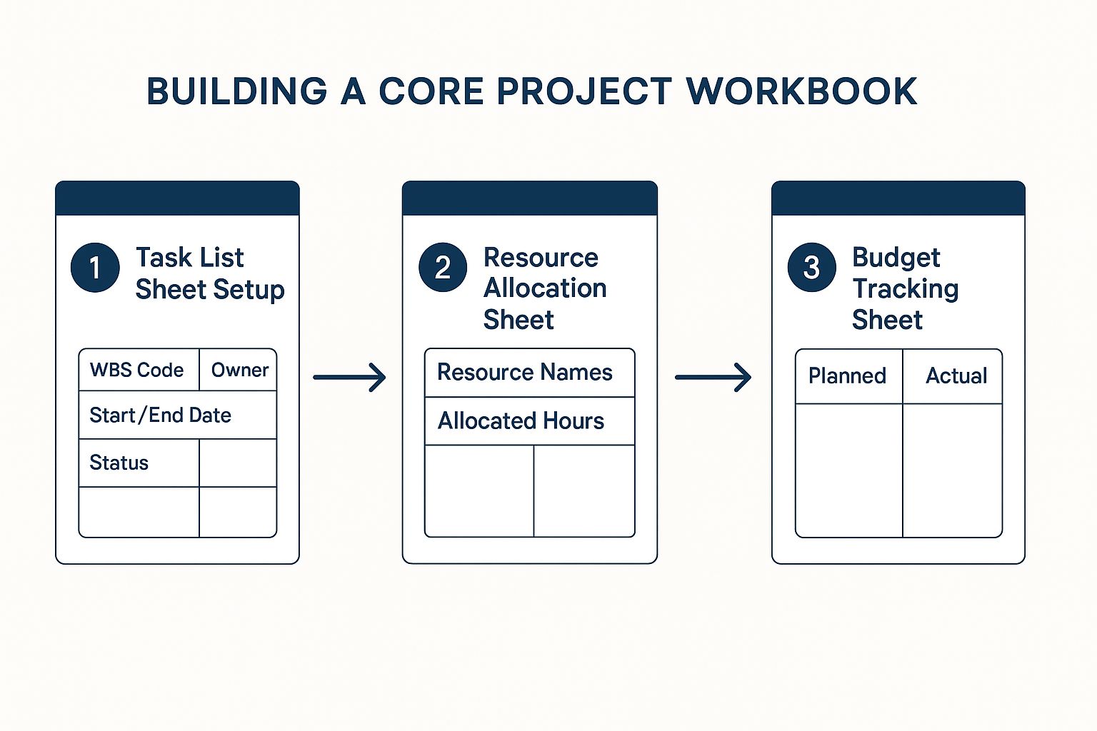
Each sheet logically builds upon the last, creating an organised system where tasks, people, and costs are clearly defined and linked. Trust me, this structure prevents a world of confusion and makes tracking progress far simpler down the line.
Setting Up Your Task List
The Task List is the engine of your project plan. This is where you break down the entire project into manageable, bite-sized pieces. Forget generic examples; let's build a structure that provides genuine clarity.
Start by creating these columns in your first worksheet:
- WBS Code: A Work Breakdown Structure code (like 1.1, 1.2, or 2.1) gives every task a unique ID and shows where it fits in the project hierarchy.
- Task Name: Keep it short and clear. What's the actual work to be done?
- Owner: Who is the single person responsible for getting this task over the line?
- Start Date: The planned kick-off for the task.
- End Date: The planned completion date.
- Duration (Days): How many working days is this task expected to take?
- Status: Create a dropdown list here. I usually go with 'Not Started', 'In Progress', 'Completed', and the all-important 'Blocked'.
Actionable Step: To create the 'Status' dropdown, select the column, go to Data > Data Validation. In the 'Allow' dropdown, choose 'List', and in the 'Source' box, type: Not Started,In Progress,Completed,Blocked. This prevents typos and keeps your data consistent.
This detailed structure is so much more than a to-do list; it’s a communication tool. When a stakeholder asks about the "user authentication feature," you can instantly filter by WBS code 2.3 and give a precise update on its owner, timeline, and current status.
As you get into building your core project workbook from scratch, mastering the art of writing clear product requirements is absolutely crucial for defining your project's scope. Well-defined requirements ensure every single task you list is directly tied to a specific project outcome.
Allocating Resources and Tracking Budgets
With your tasks clearly defined, the next move is to create two more sheets. Your Resource Allocation sheet should be beautifully simple, with just two columns: ‘Resource Name’ and ‘Allocated Hours/Week’. This gives you a bird's-eye view of who is working on what and helps you spot potential burnout before it happens.
Finally, your Budget Tracking sheet will keep an eye on the financial health of the project. Set it up with columns for 'Expense Item', 'Planned Cost', 'Actual Cost', and 'Variance'. This lets you compare your budget against actual spending in real time. For a more streamlined setup, it might be worth looking into a customisable https://whatpulse.pro/blog/2025-10-03-template-project-planner-excel to see these elements in action.
How to Create a Dynamic Gantt Chart in Excel
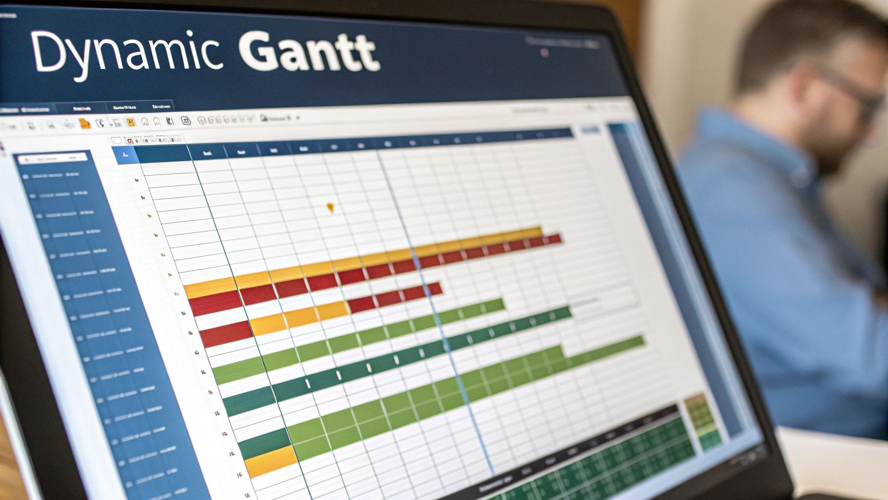 A Gantt chart brings your project timeline to life. But instead of grabbing a static template, building your own in Excel gives you a powerful visual tool that you have complete control over. With a dynamic chart, you can see task durations, dependencies, and the entire project flow at a glance.
Mastering this skill is a game-changer for clear communication. When a stakeholder asks for a quick update, showing them a well-organised Gantt chart is far more effective than talking them through a dense spreadsheet.
Using Stacked Bar Charts to Visualise Timelines
The real secret to a great Excel Gantt chart is the stacked bar chart. It might sound a bit odd, but this chart type is perfect for creating the floating bars that represent your task durations. The whole thing works because of a clever trick where you make the first part of each bar invisible.
First up, you’ll need your task list with three key columns: Task Name, Start Date, and Duration (in days). From this data, you’ll create a 2D stacked bar chart. At first, it won't look anything like a Gantt chart—it will just be a block of coloured bars starting from day zero.
Here's where the magic happens:
- Select your data: Highlight the 'Task Name', 'Start Date', and 'Duration' columns.
- Insert the chart: Go to
Insert > Chart > Bar Chart > Stacked Bar. - Format the 'Start Date' bars: Right-click on the bars that represent the start dates (usually the first set, often blue) and select 'Format Data Series'.
- Make them disappear: In the 'Format Data Series' panel, set the 'Fill' to 'No fill' and 'Border' to 'No Line'.
- Flip the task order: Right-click the vertical axis (your task list), choose 'Format Axis', and tick the box for 'Categories in reverse order'.
Just like that, the remaining bars—the ones showing task durations—will seem to "float" into their correct start times. You've just created the classic Gantt chart look. To really dig into visual project scheduling, there are some great comprehensive resources on Gantt charts that explore other applications.
Making Statuses Pop with Conditional Formatting
A truly dynamic chart should do more than just show dates; it needs to communicate status. This is where conditional formatting becomes your best friend. By setting up a few simple rules, you can make your chart automatically change colours based on a task's progress, like 'Completed' or 'In Progress'.
Actionable Step: Create a new column in your task list for 'Progress %'. Now, select the visible bars in your Gantt chart. Go to Home > Conditional Formatting > New Rule. You can create rules based on your 'Status' column (e.g., if Status="Completed", format bar green) or create a 'Data Bar' rule linked to the 'Progress %' column to show partial completion visually.
This isn't just about making your chart look pretty; it's about turning data into actionable insight. At a glance, anyone can see what’s done, what’s happening now, and what’s falling behind, without reading a single word.
For example, you could set a rule where if a cell in your 'Status' column says "Completed," the corresponding bar in your Gantt chart turns green. It’s a visual cue that’s incredibly powerful for quick project health checks.
Adding an Automatic 'Today' Line
One of the most valuable features you can add is a dynamic 'Today' line. This is a vertical line that automatically moves across your timeline each day, giving you a real-time snapshot of where your project stands right now.
Setting this up involves a bit of chart wizardry with a scatter plot overlay, but the result is a professional-grade visual that keeps everyone grounded in the present. It clearly shows which tasks should be finished, which should be underway, and which are still in the future.
The Essential Excel Formulas Every Project Manager Should Know
Once you’ve got your project workbook structured, the real magic begins. It’s time to let Excel do the heavy lifting. The right formulas can transform a static spreadsheet into a dynamic, intelligent tool that handles calculations for you, giving you insights in an instant. Honestly, getting a handle on a few key functions is a game-changer for planning projects in Excel, and it’ll save you hours of tedious manual updates.
Think of these formulas as the engine powering your project dashboard. They’re what helps you track progress, keep an eye on the budget, and calculate timelines automatically. That frees you up to focus on what actually matters: managing the project.
Counting and Summing with Conditions
One of the most common things you’ll need to do is get a quick summary of where things stand. How many tasks are actually done? How much have we spent on design resources so far? This is exactly where the COUNTIFS and SUMIFS formulas come in. They are absolute lifessentials.
COUNTIFS is brilliant for counting cells that meet several criteria at once. For example, you can get a live tally of all tasks that are both "In Progress" and assigned to a specific team member. It’s perfect for building a dashboard that gives you a real-time snapshot of the project.
SUMIFS is its close cousin, but instead of counting, it adds up values. This is crucial for budget tracking. You can use it to calculate the total spend for a specific expense category, giving you an immediate and clear picture of your budget variance.
Here’s how you might use them in the real world:
COUNTIFSExample: To count how many tasks are marked "Completed" in your status column (F2:F50), use=COUNTIFS(F2:F50, "Completed"). To count tasks assigned to "Ana" (C2:C50) that are also "In Progress" (F2:F50), use=COUNTIFS(C2:C50, "Ana", F2:F50, "In Progress").SUMIFSExample: Imagine your budget sheet has expense categories in columnAand the actual costs in columnC. To add up all the costs filed under "Marketing" (in cellsA2:A100), your formula would be=SUMIFS(C2:C100, A2:A100, "Marketing").
Calculating Actual Workdays
Project timelines rarely fit neatly into a standard calendar. Weekends and public holidays are not workdays, and your plan has to reflect that reality. This is where the NETWORKDAYS formula becomes a project manager’s best friend.
This function automatically calculates the number of working days between a start and end date. It smartly excludes Saturdays and Sundays by default, and you can even feed it a list of your specific company or national holidays to exclude as well.
Actionable Step: Create a separate list of holiday dates in your workbook (e.g., in cells J2:J10). When you write your formula, refer to this list: =NETWORKDAYS(D2, E2, J2:J10). Now your duration calculations will be perfectly accurate.
Using
NETWORKDAYSensures your duration estimates are realistic from the get-go. A task starting on a Thursday and ending the following Tuesday isn't a five-day task; it's a three-day task. This formula gets that right, every single time.
Pulling Data with INDEX and MATCH
As your project plan gets bigger, you’ll find yourself needing to pull information from one sheet into another. Maybe you want to see the hourly rate of a resource assigned to a task without having to flip back and forth to look it up manually. The combination of INDEX and MATCH is an incredibly powerful and flexible way to do this.
A lot of people reach for VLOOKUP by default, but I’ve found that INDEX/MATCH is far more robust. It isn’t limited to looking up values in the first column of a table, and it won’t break if you decide to insert a new column into your source data later on—a common headache with VLOOKUP.
Here's how they work together:
MATCHfinds the position of a value in a list. For example, it can tell you that "John Smith" is in the 5th row of your resource sheet.INDEXthen returns the value at a specific position in a list. For instance, it can grab the value from the 5th row of your "Hourly Rate" column.
Actionable Step: Let's say your resource names are in 'Resources'!A2:A10 and their rates are in 'Resources'!B2:B10. In your task list, you have a resource name in cell C2. The formula to pull their rate would be: =INDEX('Resources'!B2:B10, MATCH(C2, 'Resources'!A2:A10, 0)).
Advanced Tracking with Dashboards and Reports
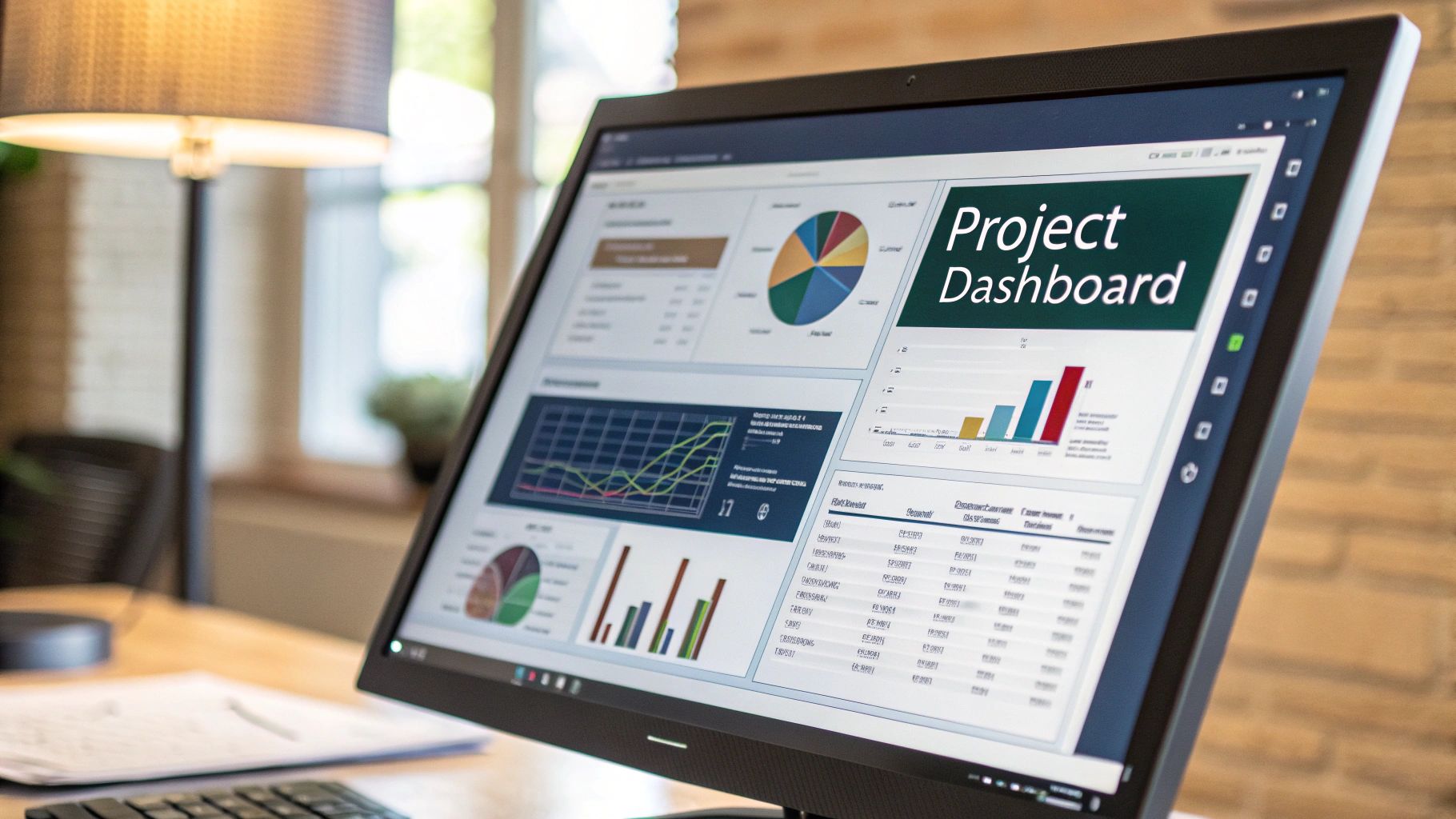
Once your project is actually moving, your focus has to shift from planning to tracking. A static list of tasks just won't cut it anymore. You need dynamic tools to see what's happening, catch problems early, and keep your stakeholders in the loop. This is where Excel dashboards and reports really start to shine.
A good visual summary turns all that raw project data into something you can actually use. It lets anyone, from your team on the ground to senior management, get a read on the project's health in just a few seconds.
Building a Dynamic Project Dashboard
The quickest way to get an interactive dashboard up and running is with PivotTables and PivotCharts. These are Excel's powerhouse tools for summarising huge amounts of data from your task list and turning it into visuals, often without writing a single formula.
Actionable Step: First, format your task list as a Table (Insert > Table). This makes it dynamic, so your PivotTables will update automatically when you add new tasks. Then, select any cell in your table and go to Insert > PivotTable to get started.
From there, you can drag and drop fields to slice and dice your project data from all sorts of angles. For example, you could quickly put together charts showing:
- Task Status Breakdown: Drag 'Status' to the Rows area and a count of 'Task Name' to the Values area. Then, create a PivotChart from this data.
- Workload Distribution: Put 'Owner' in the Rows area and a count of 'Task Name' in Values.
- Budget vs. Actuals: A column chart comparing your planned costs against what you've actually spent is a must-have for any project manager.
A well-designed dashboard tells a story. It should instantly answer the most important questions: Are we on schedule? Are we on budget? And where are the biggest risks?
To make your dashboard truly interactive, you'll want to add Slicers. Think of Slicers as fancy, user-friendly buttons that filter your dashboard with a single click. You could add a Slicer for 'Task Owner' or 'Priority', letting anyone viewing the report drill down to see exactly what they need. It’s a self-service approach that saves you from having to create dozens of custom reports.
Creating a Visual Risk Register
No project plan is complete without thinking about what could go wrong. A risk register is a simple but incredibly powerful tool for this, and you can make it even better with a bit of conditional formatting.
Set up a new worksheet with columns for 'Risk Description', 'Likelihood' (on a scale of 1-5), 'Impact' (1-5), and a 'Risk Score' (which is just Likelihood x Impact). This simple structure forces you to quantify and prioritise potential problems.
Now for the visual part. Apply conditional formatting to the 'Risk Score' column to create a heat map:
- High Scores (15-25): Select the column, go to
Conditional Formatting > Highlight Cells Rules > Greater Than...and enter 14. Choose a red fill. - Medium Scores (8-14): Add another rule for
Between...8 and 14, and choose a yellow fill. - Low Scores (1-7): Add a final rule for
Less Than...8, and choose a green fill.
This colour-coded system immediately draws everyone's eye to the most serious threats. As projects adapt, tools like these are indispensable. For instance, the Netherlands' economic focus on digital transformation encourages advanced project planning. While Excel remains a cornerstone, its integration with specialised software is growing, reflecting trends where the software market is expanding. And if you're managing large datasets for these reports, knowing how to handle CSV exports is a crucial skill for moving data between systems.
Common Questions About Project Planning in Excel
When you're deep in the weeds of an Excel project plan, a few familiar questions always seem to surface. It doesn't matter if you're a seasoned pro or just getting your bearings; knowing the answers can save you a ton of headaches down the line. Let's walk through some of the most common snags people hit.
One of the first hurdles is always collaboration. How do you stop multiple versions of the same file from spiralling into chaos? While the desktop version of Excel can be a real pain for teamwork, the fix is actually pretty simple: use Excel Online or keep your files in SharePoint or OneDrive.
This simple change unlocks real-time co-authoring, letting multiple people work in the same spreadsheet at the same time. It’s a small shift in workflow that makes collaborative planning in Excel feel a lot less like a free-for-all.
How Can I Handle Complex Task Dependencies?
This one comes up a lot. You've got a task that can't kick off until another one is finished, but Excel doesn't have a built-in feature for this like dedicated PM software does. Don't worry, there's a practical workaround.
Just add a "Predecessor" column to your task list. In it, you can note the WBS code or task ID of the job that needs to be done first. From there, you can use conditional formatting to highlight any tasks where the predecessor isn't marked as 'Completed' yet.
Actionable Step: Use a formula for your conditional formatting rule. Highlight the task name column and create a new rule using a formula. The formula might look something like this: =VLOOKUP(G2, A:F, 6, FALSE)<>"Completed". This checks the status of the task ID listed in your predecessor column (G2). If it's not "Completed", the task name will be highlighted.
This system won’t automatically shift your dates around, but it gives you a powerful visual cue. You can see at a glance which tasks are good to go and which are blocked, preventing anyone from starting work out of sequence.
Is Excel Suitable for Large, Complex Projects?
This is the big one. Excel is incredibly versatile for small to medium-sized projects, but its cracks start to show as things get more complex. Once you're trying to manage hundreds of tasks, tricky dependencies, and a large team, it can become a real beast to handle.
You’ve probably hit the tipping point when:
- Version control becomes a daily battle.
- You find yourself wishing for automated notifications and reminders for task owners.
- You need granular, role-based permissions to control who can view or edit certain parts of the plan.
For massive enterprise projects, the absence of these features can introduce some serious risk. In those cases, you might still use Excel for a specific budget tracker or some ad-hoc analysis, but a dedicated project management platform is almost always a safer bet for the main plan. Excel shines when you need flexibility and control over a simple structure, not when you're steering a massive, multi-year programme.
WhatPulse provides privacy-first analytics to help your organisation understand how work actually happens. Gain insights into application usage, project time, and team productivity patterns without ever capturing sensitive content. Find out how you can optimise software spend and improve workflows at https://whatpulse.pro.
Start a free trial