

So, what do we actually mean by "data-driven decision making"?
It's simply the practice of using facts, metrics, and real insights—gleaned from data—to guide your strategic choices. Instead of relying on gut feelings or old habits, you build a structured process that makes your decisions objective, measurable, and tied directly to what your business is trying to achieve. This guide provides actionable steps to implement this process using endpoint analytics.
Building Your Foundation for Data Driven Decisions
It's tempting to jump straight into fancy dashboards and analytics tools, but that's a classic mistake. An effective data-driven approach doesn't start with technology. It starts with people, culture, and a crystal-clear sense of purpose. Before you can get any real value from endpoint analytics, you have to build a solid foundation first.
This is all about aligning your data collection efforts with your core business strategy. You shouldn't be collecting data just for the sake of it. Every single metric you track should answer a critical question about your organisation's performance, efficiency, or goals. This simple rule keeps your efforts focused and ensures you see a tangible return right from the start.
Aligning Culture and Strategy First
For most organisations, the biggest hurdles aren't technical; they're cultural. Employees might see data as a threat ("are they tracking me?") or just another complicated thing to learn. This is where leadership comes in. Getting genuine buy-in from the top is non-negotiable. When leaders consistently use data to explain their own decisions, it sends a powerful message across the company: evidence matters more than opinion here.
Recent findings show that for fast-growing organisations in the Netherlands, internal factors are far more important than market pressures when it comes to adopting data-driven practices. A study of Dutch companies found that executive commitment, the percentage of highly educated employees, and how well departments work together were strongly linked to success. Things like market competition or the size of the IT budget barely had an impact. The number one barrier they found? A major shortage of skilled people in data analytics.
A cultural shift toward accepting the benefits of data-driven decision-making starts with leadership. When you visibly use data to guide a decision, it reinforces evidence over instinct and builds trust in the process.
This flow shows the essential steps to get your groundwork right. It's all about aligning your goals, building a supportive culture, and figuring out what skills you have—and what you need.
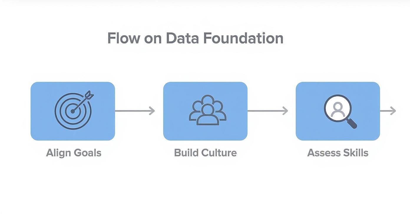
Starting with goal alignment makes sure your entire data strategy serves a clear business purpose. It's the best way to avoid wasting time and money on metrics that don't matter.
Conduct an Honest Data Maturity Assessment
To set goals you can actually hit, you need to know where you're starting from. A data maturity assessment isn't about passing or failing; it's a realistic snapshot of what your organisation can do right now.
Here's a practical way to conduct this assessment:
- Form a small, cross-functional team: Include members from IT, HR, and a key business unit to get diverse perspectives.
- Use a simple survey: Ask targeted questions to gauge current capabilities in three key areas:
- Skills: Do your teams have the basic data literacy to read a report and ask smart questions? Or does a spreadsheet make their eyes glaze over?
- Tools: Can your current tech stack actually collect, process, and visualise the data you need, or is it holding you back?
- Processes: Are there clear, established workflows for how insights get shared and, more importantly, acted upon?
- Analyse the results: Look for common themes and identify the most critical gaps. This isn't about finding blame; it's about creating a clear roadmap for improvement.
Answering these questions honestly will shine a light on the critical gaps you need to fill. As you build this foundation, it's also smart to think ahead and prepare for common AI implementation challenges, especially those that crop up around data strategy.
Getting this foundational work right ensures your journey into endpoint analytics starts on the right foot, poised for success. You can learn more about fostering the right kind of environment in our guide on how to optimise work patterns with data transparency.
Choosing Metrics That Actually Matter
Making the switch to a data-driven culture means getting past vague, high-level goals. The real magic of endpoint analytics happens when you translate broad business objectives into specific, measurable Key Performance Indicators (KPIs). Without this, you’re just collecting data for the sake of it. With it, you’re gathering targeted intelligence.
Generic metrics only lead to fuzzy, uninspired actions. A goal like "improve employee productivity," for instance, is pretty meaningless on its own. What does "productivity" actually look like? Does it mean fewer app crashes? Faster boot times? Less time waiting for a software build to finish? Each of these questions points to something tangible you can track, measure, and actually improve.

The trick is to steer clear of vanity metrics—those numbers that look great on a chart but don’t really say anything about the health of the business. A high number of software installs doesn't mean much if nobody is actually using the application. You need to focus on KPIs that are directly tied to strategic outcomes.
KPIs for Different Business Functions
The right KPIs are always specific to the department using them. An IT manager, a procurement specialist, and an engineering lead are all trying to solve very different problems, so their metrics have to reflect that. This is where endpoint analytics really shines.
To give you a better idea, here's a look at some sample KPIs that different teams could track using endpoint data.
| Department | KPI | Business Question It Answers |
|---|---|---|
| IT | Application Stability Score | Which software is causing the most problems for our employees? |
| Average Device Boot Time | Are slow computers creating a bottleneck for our team? | |
| Network Latency per Application | Is our network infrastructure supporting our critical cloud tools? | |
| Procurement | Underutilised Software Licence Rate | Where are we wasting money on software nobody is using? |
| Hardware Refresh Cycle Efficacy | Are we replacing devices too early or too late? | |
| Average Application Load Time | Are employees getting the performance they need from our approved software? | |
| Engineering | Build Environment Performance | How long are developers waiting for code to compile? |
| Development Tool Resource Consumption | Are specific apps bogging down our developers' workstations? | |
| IDE & Plugin Crash Rate | Are the tools we provide stable enough for uninterrupted work? |
These examples show how KPIs can be tailored to provide actionable answers, not just more numbers.
- For IT Teams, the game is all about stability, security, and performance. Instead of just tracking uptime, measuring an Application Stability Score helps you proactively spot buggy software before it causes a company-wide headache.
- For Procurement Teams, it's about cost-efficiency and smart resource allocation. A KPI like the Underutilised Software Licence Rate directly points to wasted spending. Simple as that.
- For Engineering Teams, efficiency and development speed are everything. Measuring Build Environment Performance tells you exactly how long compilations take, which is a direct hit to developer productivity.
The most effective KPIs aren't just numbers; they are answers to specific business questions. An 'Application Stability Score' answers, "Which software is causing the most problems for our employees?" An 'Underutilised Licence Rate' answers, "Where are we wasting money on software nobody uses?"
Picking the right metrics is your first real step towards building a system of continuous improvement. Establishing these initial figures is crucial, as they form the foundation for everything that comes next. To dig deeper, you can explore our guide on setting up baseline metrics for continuous improvement to help shape your strategy.
By selecting KPIs that are directly linked to real-world business outcomes, every piece of data you collect becomes a tool for making smarter, faster decisions. This focused approach is what turns data from a passive resource into an active driver of success.
Collecting Endpoint Data Without Sacrificing Privacy
Gathering device data is a classic balancing act. On one hand, you need solid facts to make smart, data-driven decisions. On the other, protecting employee privacy is non-negotiable. If you get this wrong, you don’t just risk trouble with regulations like GDPR; you chip away at the trust your whole data-driven culture is supposed to be built on.

The trick is to start with a privacy-first mindset. This isn't about vacuuming up every byte of data you can and then trying to anonymise it later. It's about being intentional. It's about data minimisation—the principle of only collecting the information you absolutely need to answer your specific questions, and nothing more.
For instance, if your goal is to spot underused software subscriptions, you need to know which apps are running and for how long. You absolutely do not need to know what someone is typing into those apps. That distinction is the heart of building a data pipeline that’s both effective and trustworthy.
Adopting Privacy-First Instrumentation
When you roll out analytics agents to your company's endpoints, it has to be a transparent process. That journey begins with choosing tools that have privacy controls baked right into their core. You have to look past the marketing slogans and find concrete features that show a real commitment to a privacy-conscious approach.
Here’s a practical checklist to use when evaluating any new analytics tool:
- Granular Data Control: Can you easily configure the agent to collect only specific metrics (like application uptime) while excluding others (like window titles or network content)? You need that level of control.
- Anonymisation by Default: Does the tool aggregate data and strip personally identifiable information (PII) automatically? Or does it require you to do it manually? The focus should always be on trends, never individuals.
- Transparent Data Policies: Is it dead simple to find out what data is collected, how it’s stored, and for how long? A provider you can trust will be upfront about their process. As a reference for what to look for, you can learn more about how WhatPulse handles privacy and the data it collects.
- User Consent and Visibility: Does the tool make it easy to communicate with employees about what’s being monitored? Trust is built on transparency.
The goal of endpoint analytics should be to understand how work gets done, not who is doing what. By focusing on aggregated, anonymised data, you can spot systemic issues like crashing software or slow networks without ever crossing the line into individual surveillance.
To really nail this, it's crucial to follow current data privacy best practices. This means getting comfortable with techniques like data aggregation, where individual data points are rolled into summary statistics, and pseudonymisation, which swaps out private identifiers for artificial ones.
At the end of the day, successful instrumentation isn't just a technical problem to solve. It’s a statement about your organisation's values. When you prove you can gather powerful insights while fiercely respecting privacy, you build the cultural foundation your data-driven initiatives need to thrive for the long haul.
Turning Raw Data Into Actionable Insights
Raw data from hundreds, or even thousands, of endpoints is really just noise. A massive spreadsheet filled with application usage times and network latency figures doesn't magically tell you what to do next. The real value gets unlocked when you translate all that raw information into a clear, visual story that people can understand at a glance.
This is where well-designed dashboards and reports come into play. The goal isn’t just to throw numbers on a screen; it's to provide context. The right visualisation can turn a complex dataset into an intuitive insight, closing the gap between seeing the data and making a smart, data-driven decision. If you skip this step, even the most precise data collection in the world will fall flat because nobody can figure out the "so what?" behind the numbers.
Choosing the Right Visuals for Your KPIs
Not all charts are created equal. In fact, picking the wrong one can hide the truth just as effectively as a messy spreadsheet. The type of visualisation you choose has to match the story your KPI is trying to tell.
Start by asking yourself what specific question you're trying to answer.
- Want to track changes over time? A simple line chart is your best friend. An IT manager tracking Average Device Boot Time over a quarter can instantly see if a new software update caused a spike in login delays.
- Need to compare values across different groups? Bar charts are perfect for this. A procurement team could use one to compare the Underutilised Software Licence Rate across departments, immediately showing where the biggest cost savings are hiding.
- Trying to understand distribution and density? Heat maps are incredibly powerful. Visualising Application Usage Hotspots during the workday shows which tools are most critical during peak hours, which can inform decisions on everything from server resources to network priorities.
The key is to pick a format that makes the main insight impossible to miss.
Creating Role-Specific Views
An IT manager, a CFO, and an engineering lead can all look at the same endpoint data, but they each need to see it through a completely different lens. A one-size-fits-all dashboard just won't cut it. To get people to actually use the data, you need to build tailored views for each role.
An IT manager's dashboard might be all about operational health—things like application crash rates, network latency, and device performance. A CFO's view, on the other hand, needs to translate that same data into financial terms: the cost of unused software, hardware lifecycle ROI, and the financial hit from employee downtime.
This customisation is what drives action. When people see data presented in the context of their own responsibilities and goals, they’re far more likely to engage with it and use it to make better choices.
Take an engineering lead, for example. They need a dashboard that surfaces things like Build Environment Performance and the stability of their development tools. This helps them spot technical bottlenecks that are slowing their team down—a concern that’s worlds away from the CFO’s focus on licence costs.
By creating these role-specific views, you transform the dashboard from a passive report that gets ignored into an active, indispensable tool for making decisions.
Implementing a Practical Data Governance Framework
A data-driven decision program built on endpoint analytics lives and dies on one thing: trust.
Without clear rules of the road and genuine confidence in your data, even the most beautiful dashboards are just expensive decorations. This is where a data governance framework comes in. Forget the complex, bureaucratic nightmare you might be picturing. Think of it as a practical set of guidelines that makes your data reliable and your insights defensible.
This is about creating a "constitution" for your data. It needs to clarify who can see what, who is responsible for keeping it clean, and how it can be used. My advice? Start simple. Aiming for a perfect, all-encompassing policy from day one is a recipe for a project that never finishes. The goal is to build a system that delivers consistency and security without grinding everything to a halt.
This approach isn't just theory; it's how effective organisations operate. Look at how the Dutch government helps its municipalities improve their digital maturity. They use structured assessments to get a clear picture of their strengths and weaknesses in data governance. This helps them create targeted strategies for everything from training to tech investment, ensuring data is used responsibly to serve citizens. You can see more on how Dutch municipalities are advancing data-driven decision making.
Defining Key Roles and Responsibilities
To make your governance framework actually work, you have to assign clear roles. It’s the only way to avoid confusion and create real accountability.
Here’s a simple breakdown of roles to assign:
- Data Owners: These are senior leaders, like a department head, who are ultimately accountable for the data in their domain. For instance, the Head of IT would "own" all endpoint performance data.
- Data Stewards: Think of these as the hands-on experts. They handle the day-to-day management, making sure the data is clean, accurate, and properly defined. An IT systems analyst might be the steward for application stability metrics.
- Data Users: This is basically everyone else who needs the data to do their jobs. Your framework must define what different groups—like IT, Finance, or Engineering—can see and do with it.
A simple data governance framework isn't about restriction; it's about empowerment. By defining who owns the data and who ensures its quality, you give everyone the confidence to act on the insights they see.
Establishing Access Controls and Security
Once the roles are clear, the next practical step is locking down access. Not everyone in the company needs to see raw, unfiltered endpoint data. A role-based access control (RBAC) model is almost always the most straightforward and effective approach.
Here is an actionable plan for setting this up:
- Map roles to data needs: List your key roles (e.g., IT Admin, Finance Analyst, Team Lead) and identify the specific data each one requires.
- Configure user groups: In your analytics tool, create user groups that correspond to these roles.
- Assign permissions: Grant each group access only to the dashboards, reports, and data sets relevant to their function. An engineer probably needs granular performance metrics from their development tools but does not need to see software licence utilisation data for the entire company.
- Review regularly: Audit these permissions quarterly to ensure they are still appropriate as roles and responsibilities change.
Setting up these controls ensures sensitive information stays secure and people only see the data relevant to their roles. This cuts down on the noise, makes dashboards far more effective, and solidifies a governance framework that helps your decision-making process become reliable, secure, and scalable.
Got Questions? We’ve Got Answers.
Jumping into data-driven decision-making always brings up a few practical questions. It’s completely normal. Here are some of the most common ones we hear, with straightforward answers to help you get started with endpoint analytics.
How Do We Start Data-Driven Decision-Making with a Small Budget?
The trick is to start small and aim for a quick win. Don't fall into the trap of trying to analyse everything at once. Instead, pick a single, high-impact business problem you know endpoint analytics can solve.
A great place to begin? Look for unused software licences to cut down on your monthly spend. It’s a use case everyone understands, and it delivers a clear, immediate financial return.
Use the success of that small pilot project as concrete proof of value. It’s the best argument you’ll have for securing a bigger budget and expanding your data-driven efforts to other parts of the organisation.
What Is the Biggest Hurdle in Building a Data-Driven Culture?
It’s almost never about the technology. The real challenge is cultural. You’re asking people to shift from relying on gut feelings and intuition to trusting data-backed evidence, and that’s a big change. This transition takes patience and consistent effort, from the top down.
Here are three actionable steps to start overcoming that hurdle:
- Lead by example: When senior leaders visibly use data to justify their own decisions, it sends a powerful message that evidence is valued.
- Make it accessible: Offer training that improves data literacy. The goal is to present insights in a way anyone can understand, not just the data analysts.
- Celebrate the wins: Make a point to highlight every success—big or small—where data led to a demonstrably better outcome.
When your teams are involved in the process and see for themselves how data makes their jobs easier, they'll start to embrace the change.
How Can We Collect Endpoint Data While Ensuring Employee Privacy?
Privacy can’t be an afterthought. It has to be a core principle from day one. Building trust with your employees is everything, and that begins with being completely transparent about what data you’re collecting and, just as importantly, why.
The key is data minimisation. Only gather what you absolutely need to achieve a specific, stated goal. Your focus should be on aggregated trends, not monitoring individuals. For instance, understanding application crash rates across the company is valuable; knowing which specific person was using the app when it crashed is unnecessary.
You should be using tools with strong, built-in anonymisation features that obscure any personally identifiable information. Enforce strict, role-based access controls and maintain a clear, accessible governance policy. Following regulations like GDPR isn't just a legal checkbox—it's the foundation for building the trust you need for a successful analytics program.
WhatPulse provides a privacy-first analytics platform to help your organisation understand how work happens. Turn real usage data into actionable decisions while maintaining employee trust. Learn more at https://whatpulse.pro.
Start a free trial