
You can build a Gantt chart right inside Google Sheets. It’s a free, flexible, and collaborative way to visualise your project timeline without paying for dedicated software. Many teams prefer it for the accessibility and control it offers.
Why Use Google Sheets for Your Gantt Chart
Dozens of specialised project management tools exist, but Google Sheets has some specific advantages. It costs nothing and is available to anyone with a Google account. It also gives you complete control over the chart’s design and logic. You can build it to fit your exact workflow instead of being boxed into a template.
If you want a refresher on how these visual tools can change your project planning, read about the core ideas behind Gantt Charts for Seamless Project Management.
This DIY approach works well in a few scenarios. An IT team coordinating a multi-stage software rollout or a marketing group planning a complex campaign can use a shared, live document to keep everyone on the same page.
The Power of Real-Time Collaboration
A Google Sheets Gantt chart allows live collaboration. Team members can update their own task progress simultaneously, and everyone else sees those changes instantly. This cuts out the slow back-and-forth of email chains and outdated spreadsheet versions.
It provides a single source of truth where the team can plan and track work together.

This direct access keeps the team aligned on deadlines and dependencies, reducing the risk of miscommunication.
Proven Efficiency Gains
This isn't just a hunch. A recent study in the Netherlands found that 55% of 1,200 project managers in Amsterdam and Rotterdam preferred Google Sheets Gantt charts for their cost-free collaboration features.
They reported that real-time editing cut project delays by an average of 23% compared to managing schedules over email. IT project efficiency jumped by 30% when teams used customised charts with automatic updates.
For small to mid-sized projects, the combination of zero cost, easy access, and real-time teamwork makes a Google Sheets Gantt chart a good choice. You can always explore other tools to create Gantt charts online if you have different needs.
Setting Up the Gantt Chart Foundation
Start with a fresh Google Sheet. The goal is to build a solid framework. The power of a good Gantt chart comes from a simple, logical data structure, not fancy add-ons.
We need four core columns: Task Name, Start Date, End Date, and Duration. This structure drives all the automatic calculations, saving you from manually updating every task when one thing changes.
Defining Your Project's Core Data
First, set up your headers in the first row. Put Task Name into A1, Start Date into B1, End Date into C1, and Duration into D1. This clean organisation is the backbone of the chart.
Now, add a few sample tasks. List some task names down column A. Then, for each one, manually enter a Start Date (column B) and an End Date (column C). Make sure your dates are all in the same format (e.g., DD/MM/YYYY). Google Sheets can get confused by inconsistent formatting, which is a common source of errors.
Calculating Task Duration Automatically
The Duration column is where we can add a formula. Instead of counting days, a formula will do the work. A simple way is to subtract the start date from the end date: =C2-B2. This works but gives you the total number of calendar days, including weekends.
Most projects run on business days, which makes the NETWORKDAYS function a better fit. In cell D2, type this formula:
=NETWORKDAYS(B2, C2)
This function calculates the number of working days between your start and end dates, skipping weekends by default. Now, grab the small blue square in the corner of cell D2 and drag the formula down the rest of the column. If you push a task's end date back a week, the duration updates on its own.
Getting this data structure right from the start is important. It dictates how everything else, from the visual timeline to progress tracking, will behave. The logic is similar to a pre-built template, but building it yourself gives you total control.
Building the Timeline Axis
With your task data in place, it’s time to build the visual timeline across the top of the sheet. This horizontal axis is what your task bars will hang on.
Starting in column E, begin listing dates horizontally. You can format this to match your project's scale.
- For short projects: Listing individual days is probably best. Enter your project's start date in
E1, then=E1+1inF1, and drag that formula across as far as you need. - For longer projects: A weekly or monthly view is cleaner. For a weekly view, enter the date for the start of the first week, then use
=E1+7in the next cell to jump forward a week at a time.
Make the timeline columns narrow. This lets you see a good portion of your project without endless scrolling. A clean, well-structured timeline makes the whole chart easier to read.
If you've spent time in other spreadsheet tools, these principles should feel familiar. For more ideas on structuring project data, our guide on a project planner template in Excel covers some related concepts.
Creating the Visual Timeline with Conditional Formatting
With the data structure in place, we can turn the list of dates and tasks into a visual timeline. We’ll use conditional formatting to automatically color the cells that fall within each task's start and end dates, creating the bar chart effect.
The process relies on a custom formula. This rule will check each date in your timeline against every task's date range. If a timeline date falls between a task's start and end dates, the cell gets colored in.
This diagram breaks down the basic flow, from setting up your data to building out the visual timeline.
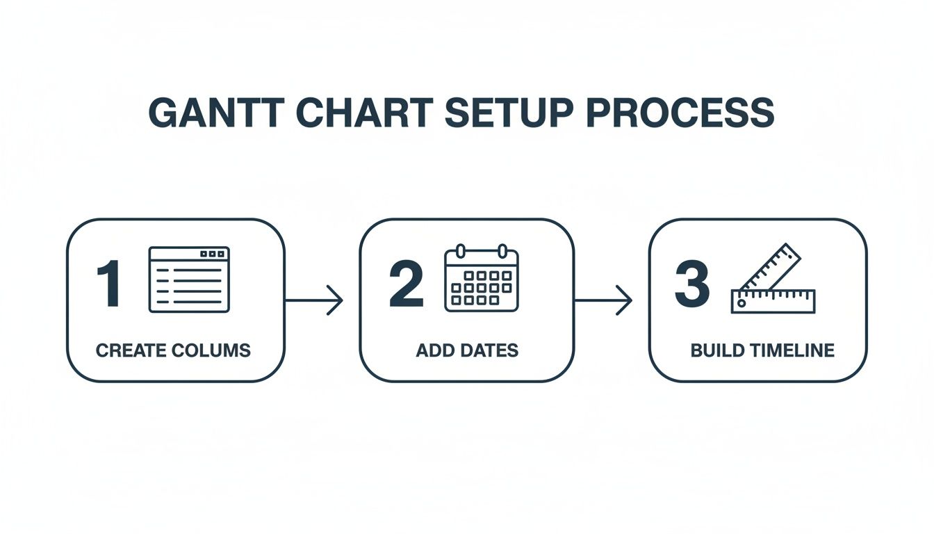
Each step builds on the last, turning a standard spreadsheet into a useful project management tool.
Applying the Core Formatting Rule
First, set up the main rule. Select the entire range where your timeline bars will appear. This is all the cells under your horizontal date axis, right next to your task list. For instance, if your timeline starts at cell E2 and stretches to Z20, you'll select that whole block.
With the range highlighted, go to Format > Conditional formatting. A panel will open on the right. Under the "Format rules" dropdown, choose Custom formula is.
The formula you need is a combination of the AND function and specific cell references:
=AND(E$1>=$B2, E$1<=$C2)
This formula tells Google Sheets to color a cell only if two things are true: the date in the timeline header (like E$1) is on or after the task's start date ($B2), and that same header date is on or before the task's end date ($C2).
The dollar signs (
$) are important here.E$1locks the formula to row 1, so it always looks at the dates in your timeline header.$B2and$C2lock the columns, making sure the formula always checks the Start and End Date columns (B and C) as it moves across the timeline for each task.
Pick a fill color for your bars—a solid blue or green usually works well—and click "Done." Your timeline should populate with colored bars showing the duration of each task.
Adding a Dynamic Today Marker
A static chart is good, but a dynamic one is better. You can add another rule that automatically highlights the current day's column. This gives you an immediate visual cue for where you are in the project.
Select the same range as before (e.g., E2:Z20) and add another conditional formatting rule. Use the "Custom formula is" option again, but this time with a simpler formula:
=E$1=TODAY()
The TODAY() function returns the current date. This rule checks each date in your timeline header (E$1) and, if it matches today's date, it applies your chosen formatting. I usually go for a distinct color like a bright red or a bold border to make it stand out.
This one rule transforms your chart from a static plan into a living document. It's a small tweak that makes a big difference in fast-moving projects.
For a deeper look at using conditional formatting for visual timelines, check out this guide on conditional formatting.
Essential Conditional Formatting Rules
Here’s a quick reference table for the custom formulas we've just covered. These bring your Gantt chart to life in Google Sheets.
| Purpose | Custom Formula Example | How It Works |
|---|---|---|
| Create Task Bars | =AND(E$1>=$B2, E$1<=$C2) | Colors a cell if its header date falls between the task's start and end dates. |
| Highlight Today | =E$1=TODAY() | Colors the entire column for the current date, giving a live progress marker. |
| Mark Weekends | =WEEKDAY(E$1, 2) > 5 | Highlights weekend columns (Saturday & Sunday) to show non-working days. |
These formulas are the building blocks for most of the visual automation you’ll need. Once you understand how they work, you can start customizing them for more advanced features, like highlighting overdue tasks or marking project milestones.
Adding Progress Tracking and Task Dependencies
A static timeline is a good start, but it isn't a project management tool until it shows you what's happening. By adding progress tracking and simple dependencies, we can turn this Gantt chart into a dashboard that reflects the real state of your project.
This is where your chart goes from a picture to a dynamic tool you can use to manage your work. We’ll add a new column for completion percentage and use a second conditional formatting rule. This gives us a two-toned effect on our task bars, showing how much is done versus what’s left.
Visualising Task Progress
First, insert a new column next to your task data—let's say column E—and call it % Complete. Format this column as a percentage. This is where you or your team will enter updates on how far along each task is.
Now, we'll apply a new conditional formatting rule over the exact same cells as your existing task bars. This second rule will use a darker shade of your original bar color to fill in the completed portion of the task.
The formula is a little more involved, but the logic is straightforward. It checks if a date on your timeline falls within the completed part of a task's duration, based on the percentage you've entered.
Here’s the custom formula you'll need. This assumes your % Complete is in column E, your Start Date is in column B, and your Duration is in column D:
=AND(F$1>=$B2, F$1<=$B2+($D2*$E2)-1)
Select your timeline range, go to Format > Conditional formatting, and add this as a new custom formula. Choose a darker version of your main task bar color. In the formatting panel, drag this new rule so it sits above your original task bar rule. This ensures it gets applied first.
Keeping Data Consistent with Validation
Typos and inconsistent language can mess up any tracking system. To keep your status updates clean, use data validation to create dropdown menus.
Add another column called Status.
- Select all the cells in your new Status column.
- Go to Data > Data validation.
- In the dialogue box, set the "Criteria" to "List of items".
- Type in your statuses, separated by commas:
Not Started, In Progress, Complete. - Hit Save.
Now, every cell in that column has a dropdown menu. This ensures everyone uses the same terms, which makes filtering and reporting on your gantt charts google sheets more reliable.
This simple step kills ambiguity. A project manager can instantly filter for all tasks marked 'In Progress' without worrying about variations like 'in progress' or 'ongoing'.
Creating Simple Task Dependencies
Google Sheets doesn't have a built-in feature for task dependencies like dedicated project management software does. But we can create a simple workaround with a basic formula. This is necessary for projects where one task can't start until another is finished.
Let's say "Task B" can't start until "Task A" is complete.
- Task A’s details are in row 2 (Start Date in B2, End Date in C2).
- Task B’s start date needs to go in cell B3.
Instead of typing a date into cell B3, you'll make it dependent on Task A's end date. Enter this formula into cell B3:
=C2+1
This formula tells Google Sheets to set the start date of Task B to one day after Task A finishes.
Now, if the timeline for Task A changes—maybe its end date gets pushed back a week—the start date for Task B automatically adjusts with it. Your project plan shifts accordingly without you having to manually recalculate dates. It builds logic into your plan, ensuring your timeline stays accurate even when things get delayed.
Managing and Sharing Your Gantt Chart
Your Gantt chart is built. But a project plan is only useful if your team actually uses it. Its value comes from being the main source for your project's timeline, and that means managing it properly.
The first job is getting the right people in. Go to the blue "Share" button in the top right of your Google Sheet. This is your control panel for who can do what.
For most of your team, all they need is to see the timeline, so View access is fine. If you have team leads who need to add comments without changing dates, give them Comment access.
Reserve Edit access for project managers or the specific people responsible for updating task statuses and dates. This prevents accidental drags or deletions that can throw your timeline into chaos.
Focusing on Specific Tasks
As your project gets bigger, the chart can start to feel crowded. This is where filtering is useful. It’s the fastest way to cut through the noise.
Google Sheets has a built-in filter function. Click anywhere on your header row, go to Data > Create a filter, and dropdown arrows will appear on each column.
Now you can zero in on what you need:
- By Task Owner: See everything assigned to one person.
- By Status: Show only tasks that are 'In Progress' or 'Overdue'.
- By Date Range: See what's planned for next week.
This is useful for team meetings. Instead of scrolling to find someone's tasks, you can filter the view for each person in a couple of clicks. While the built-in filtering is good, if your workflow is tied to other platforms, it’s worth seeing how they visualize timelines. For instance, our guide on Gantt charts for Trello digs into similar concepts within a different ecosystem.
A well-managed Gantt chart becomes the team's central coordination point. Proper sharing permissions protect data integrity, while filters make it a practical, everyday tool for tracking progress.
Printing and Exporting for Reports
Sometimes, you need a static copy for a presentation or a formal report. To get your chart out of Sheets, go to File > Download > PDF document (.pdf).
Before you download, you need to tweak the settings.
In the print settings menu, set the page orientation to Landscape. This is necessary for a long timeline. Then, under the "Scaling" dropdown, choose Fit to width. This forces the entire timeline to shrink onto a single page, making sure nothing gets cut off.
A useful tip: If you only want to print a specific part of the chart, just select the cells you want before you open the print menu. It’s a good way to exclude any messy notes or calculation columns from your final PDF.
Your Top Gantt Chart Questions, Answered
As you build Gantt charts in Google Sheets, you’ll probably have a few questions. Let's get them answered.
Should I Just Use a Pre-made Template?
For simple projects, they can work well. Google has its own 'Timeline' view built in—find it under Insert > Timeline. It's fast and requires zero setup.
But building your own chart gives you total control. You can tweak the formulas, the conditional formatting, and the layout to match what your project needs. You’re not stuck inside a rigid template. A custom build lets you add specific features, like nuanced progress tracking or dependency logic, that most templates don't offer.
How Do I Show Milestones on the Chart?
The easiest way is to create a task with a one-day duration. Give it an obvious name like "Project Kick-off" or "Final Approval."
Then, give it its own conditional formatting rule to make it stand out. You could apply a bright yellow fill or use a rule that adds a diamond symbol (◆) to the cell. This creates a clear visual cue that separates key milestones from standard tasks. It makes them hard to miss.
This simple visual distinction is effective. It draws the eye straight to critical project dates, ensuring they don't get lost among the other task bars.
Does This Replace Tools Like Microsoft Project?
It depends on the scale of your work. For small to mid-sized projects where cost and real-time collaboration are priorities, a Google Sheets Gantt chart is a good alternative.
However, if you're running large projects that need complex resource leveling, critical path analysis, and detailed reporting, a dedicated tool like MS Project is probably a better fit. Google Sheets is best for accessibility and teamwork. It's for teams that need to stay aligned without a steep learning curve or expensive software licenses.
WhatPulse provides privacy-first analytics to help you understand how work actually happens across your organisation. See how your teams use software, manage projects, and stay focused. Learn more at https://whatpulse.pro.
Start a free trial