
You have the data. It's in spreadsheets, databases, and SaaS platforms. Now you need to make sense of it to answer hard business questions. Are you overspending on software? Is the new CRM being used? Where does work stall between engineering, support, and ops?
Pretty charts won't help if the platform can't survive procurement, security review, and real usage at scale. Enterprise teams need more than a dashboard builder. They need deployment options that fit their environment, security controls that hold up in the EU, and a cost model they can defend when renewals hit.
The market is moving in that direction fast. One market forecast put global data visualisation tools at $8.5 billion in 2023, with a projection to reach $15 billion by 2030 at a 9.5% CAGR, while also noting that Microsoft Power BI, Tableau, and Looker dominate the enterprise segment and Excel still remains widely used globally for visualisation work (global data visualisation tools market forecast). Another adoption snapshot is more sobering. Active BI and analytics tool usage sits at 25% of employees on average, even while investment continues to rise (BI and analytics adoption strategies infographic).
That gap matters. Buying a BI platform is easy. Getting people to use it, trust it, and feed decisions with it is the difficult part.
This guide stays on enterprise-ready data visualization tools. It looks at cloud versus on-prem deployment, EU data handling, governance, and total cost of ownership. It also calls out where a tool fits best, and where it doesn't.
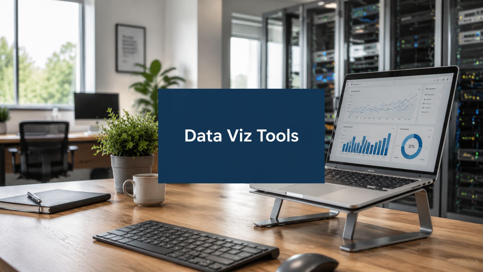
1. WhatPulse

A common enterprise reporting gap shows up before BI even starts. Procurement sees licences. SaaS admins see seats. Finance sees renewal costs. Nobody sees what is used on the endpoint.
WhatPulse Professional addresses that specific problem. It focuses on endpoint analytics for IT, finance, and operations teams that need evidence from user devices, not just application logs or vendor billing screens. That makes it a practical fit for licence reclamation, adoption tracking, shadow IT review, and version rollout checks.
Where it fits best
WhatPulse works well when the question is operational, not exploratory. Which installed apps are active? Which browser tools are getting daily use? Which departments still rely on the old version after the migration deadline? General BI platforms can visualize those answers, but they usually do not collect the raw usage data themselves.
The platform uses lightweight clients on Windows and macOS, plus a browser extension for web app visibility. Data appears quickly in a live dashboard without a long data modeling project. For teams trying to reduce SaaS waste before renewal season, that speed is a key advantage.
Deployment is also aligned with how enterprise IT already works. You can roll it out through Intune, Group Policy, Jamf, or another MDM process, which keeps ownership with endpoint teams instead of creating a side project for data engineering.
Practical rule: If the business case depends on actual usage, collect it at the endpoint first. Licence portals and procurement records rarely show overlap, underuse, or tool substitution clearly enough.
Privacy, deployment, and TCO
WhatPulse stands out by keeping the data collection scope narrow. It is EU-hosted, GDPR-aligned, and designed to avoid the standard objections that come with employee surveillance tools. It does not capture screenshots, keystroke content, or individual URLs. Data can be exported or deleted when needed, which makes legal, security, and works council reviews more manageable.
That design creates a clear trade-off. Teams that need content-level auditing or forensic web history will need another tool. Teams focused on software optimization, workforce analytics, or rollout measurement usually do not need that level of detail, and they benefit from the lower privacy risk.
For enterprise buyers, the more useful comparison is stack fit. WhatPulse is not a replacement for Tableau or Power BI. It is the collection layer for endpoint and software usage. A sensible stack is WhatPulse for endpoint telemetry, then Power BI or Tableau for executive reporting and broader financial analysis. That split can reduce licensing waste without forcing a heavy BI product to do device-level collection work it was never built for.
Cost control is another strong point. Pricing is simple at $4 per active computer per month, with a 14-day free trial and custom volume pricing for larger estates. In practice, that often leads to a lower total cost of ownership than tools that look cheaper on paper but require weeks of setup, custom instrumentation, or consulting time before anyone trusts the output.
A wider privacy point is also relevant. EU buyers often need clear data residency answers early in security review, especially for workforce or endpoint data. WhatPulse is easier to defend in those discussions than products built around invasive monitoring.
For teams building a measurement plan around software spend or rollout adoption, asking better questions of your data is a better starting point than adding another dashboard layer.
Pros
- Strong enterprise fit for endpoint analytics: Useful for licence optimization, software adoption tracking, and shadow IT review.
- Privacy-first design: EU hosting, GDPR-aligned handling, and no screenshots or keystroke content.
- Deployment flexibility: Intune, Group Policy, Jamf, and standard MDM workflows fit existing endpoint operations.
- Predictable cost model: Per-device pricing is easier to forecast than capacity-based BI licensing.
Cons
- Requires endpoint rollout: IT still needs to deploy clients and the browser extension.
- Limited by design: Teams that need page-level or content-level surveillance will find the privacy controls restrictive.
2. Tableau

Tableau still earns its place when analysts need depth. If your team wants to explore data freely, build polished visual narratives, and give business users governed self-service, Tableau remains one of the safest enterprise picks.
The main reason large teams keep it around is flexibility without giving up structure. Analysts get rich visual authoring, data prep, and semantic modelling. Admins get role-based governance and a mature content lifecycle. Procurement gets a product that security teams already know.
Deployment and enterprise fit
Tableau gives you a real deployment choice. Tableau Cloud works well when you want hosted convenience. Tableau Server still matters if your organisation has on-prem rules, private cloud requirements, or stricter data residency handling inside the EU.
That split is useful in the Netherlands and wider EU. Some teams want managed infrastructure. Others need full control over where workloads run and how access is segmented.
Tableau is expensive to run badly. It's worth it when you standardise, define ownership, and stop every department from publishing its own version of the truth.
Tableau's Creator, Explorer, and Viewer roles also help when you're trying to keep authoring under control. Without that structure, self-service BI turns into dashboard sprawl fast.
What works and what doesn't
What works is visual depth. Tableau is still one of the best tools for analysts who need to iterate quickly, especially when the question isn't fully known at the start. Its ecosystem is also mature. Training, consulting support, and internal hiring are easier than with niche platforms.
What doesn't work as well is cost discipline if you don't manage licences tightly. Tableau can become expensive when teams overbuy authoring seats or duplicate content across business units. That isn't a Tableau-only issue, but it shows up quickly here because the platform is so capable.
AI additions such as Pulse and newer agent features are useful if your users already trust the underlying data model. If the model is weak, those features just accelerate confusion.
3. Microsoft Power BI

Power BI is usually the practical default for Microsoft-heavy shops. If your identity, productivity, and cloud stack already sit inside Microsoft 365 and Azure, Power BI gives you a short path from raw data to governed dashboards.
That convenience is why it shows up so often in standardisation decisions. In Dutch enterprise surveys, 89% of IT directors rated Power BI and Tableau as highly effective for cross-functional collaboration (SSRN paper on Dutch data visualisation tool adoption).
Why enterprise teams pick it
Microsoft Power BI works best when you need semantic models, row-level security, and close ties to Azure, Teams, SharePoint, and Fabric. For IT departments, that integration lowers friction. For security teams, it means fewer identity and access exceptions to document.
The EU data handling story is also stronger than many buyers assume. EU Data Boundary and Multi-Geo options matter if your legal team cares where processing and storage take place.
If you're planning a Fabric-heavy rollout, this is one area where skills matter more than the licence sheet. Teams doing DP-700 certification preparation usually end up with better models and fewer painful rebuilds later.
The real trade-off
Power BI's low entry point is appealing. The confusing bit is tiering. Pro, Premium Per User, and capacity-based options can make budgeting messy if you don't know your sharing model up front.
Non-Microsoft sources also need planning. Gateways, network paths, and refresh design can become the hidden cost in an otherwise straightforward deployment.
A useful mindset is to treat Power BI as part of an operating model, not a standalone app. If you want the dashboards to drive decisions, pair them with actual usage telemetry. That's where moving from data to decisions becomes more than a slogan.
4. Qlik Sense

Qlik Sense is the tool I reach for when a team needs to explore messy relationships across data sets without pre-defining every path. Its associative engine is still its main advantage. You can click into one slice of data and expose related and unrelated values in a way that feels different from standard filter-based BI.
That matters when business questions are broad, or when nobody trusts the existing reporting logic.
Where Qlik Sense earns its keep
Qlik Sense fits well in organisations with lots of disparate data and analysts who need discovery first, reporting second. It also works when governance can't be optional. Qlik Cloud covers the SaaS route, while client-managed deployment still gives regulated teams an on-prem or private-cloud answer.
For EU buyers, that flexibility is useful. It's one of the reasons Qlik stays in the shortlist with Tableau and Power BI for more tightly controlled environments.
A secondary strength is extensibility. APIs and automation options are mature enough for teams that want to embed insights into business processes rather than leave them sitting in a portal.
Where buyers get stuck
The cloud pricing model can be hard to estimate cleanly because it's capacity-based. That makes finance reviews less comfortable than a per-user model, especially when adoption is still uncertain.
Client-managed pricing is also usually a sales conversation, not a self-serve purchase. That's normal for enterprise software, but it slows comparison work. If you're already implementing Power BI, Qlik tends to win only when the associative exploration model solves a real pain point that Power BI doesn't.
5. Google Looker Studio

Looker Studio is the fast answer when a team needs dashboards this week, not after a quarter of platform planning. It's especially common in marketing, web analytics, and Google-heavy data environments.
That speed is the appeal. You connect sources, assemble dashboards, share them, and move on.
Best use case
Google Looker Studio is good for quick reporting layers on top of Google services and partner connectors. The free edition is enough for many internal reporting jobs. The Pro tier adds more organisational controls, admin features, and support paths through Google Cloud.
If your team already lives in BigQuery, Ads, Search Console, and Sheets, Looker Studio feels immediate. That's useful when you need broad access and light training.
If governance is weak, Looker Studio becomes a dashboard publishing tool, not a BI platform. That can be fine. Just don't confuse the two.
Where it falls short
On its own, Looker Studio isn't the strongest choice for governed semantic modelling at enterprise scale. If the business needs one shared metric layer across departments, pairing it with core Looker is the safer route.
That means total cost of ownership depends on how far you want to take it. Cheap and fast for reporting. Less convincing as the sole analytics workhorse for a large, regulated organisation.
6. Grafana

Grafana started in observability, and that DNA still shows. It's excellent when your team watches systems in real time and wants business signals alongside telemetry. For DevOps and engineering leads, that combination is often more useful than a classic BI tool.
It also has one of the more practical deployment stories in this list. You can self-host it for full control or use Grafana Cloud with EU region options.
Strongest use cases
Grafana shines when the question is live and operational. Service health, infrastructure trends, deployment effects, error spikes, and SQL-backed operational metrics all sit comfortably in one place. The plugin ecosystem is broad, which gives teams room to unify metrics from several backends without building custom front ends.
That's also why Grafana works well in hybrid stacks. Engineering can watch Prometheus and logs. Ops can track a few business KPIs. Nobody has to switch tools every five minutes.
Cost and feature limits
The catch is pricing predictability in cloud deployments. Usage-based models are great until nobody watches ingestion growth. Then the invoice gets attention.
Traditional BI features are thinner here. You won't get the same semantic layer, polished board-reporting flow, or business-user experience as Tableau or Power BI. If your audience is mainly non-technical managers, Grafana can feel rough unless someone curates it carefully.
7. Kibana

Kibana is for teams that already think in logs, indices, and search. If Elasticsearch is central to your stack, Kibana gives you a natural visual layer for operational analytics, security investigation, and time-series exploration.
It's less polished for line-of-business BI. That's fine. It's not trying to be Tableau.
Best fit inside the enterprise
Kibana is a strong choice for search-centric analytics, observability, and security workflows. The Lens editor makes dashboard building easier than it used to be, and features like anomaly detection and alerting make it more than a charting layer.
Deployment options are sensible too. Elastic Cloud supports EU regions, while self-managed deployments give security-conscious organisations tighter control over data placement and operations.
For operations centres and platform teams, this is one of the few data visualization tools that feels native rather than adapted.
Where to be careful
Kibana can be intimidating for business users who don't live in Elastic every day. If finance or procurement needs broad self-service analytics, this won't be the friendliest entry point.
Forecasting cost also takes work because spend maps to cluster resources, not just users. If your team wants stronger incident response dashboards and richer real-time monitoring practices, Kibana is often a better fit than a conventional BI suite.
8. Apache Superset

Superset is one of the better open-source options for teams that want control without building a visual layer from scratch. It connects directly to modern SQL engines and warehouses, includes a no-code chart builder, and gives analysts a solid SQL IDE.
That combination makes it attractive to data teams with strong internal capability and low appetite for licence-heavy BI contracts.
Why it works
Apache Superset makes sense when self-hosting is a requirement or when EU data handling rules push you away from fully managed SaaS. It's also a good fit for modern warehouse-first stacks where analysts already know SQL and don't need much hand-holding.
The plugin model helps if you want custom chart behaviour or deeper internal integration. Authentication support through LDAP, OIDC, and SAML also helps it fit into enterprise identity patterns.
What you give up
The savings on software licences can reappear as internal labour. Superset is strong, but it expects you to own more of the operating burden. Support, upgrades, and production hardening need a real team behind them.
If your users want polished governance workflows, vendor-backed support, and less admin overhead, commercial tools still have the edge. Superset is best when your organisation is comfortable trading licence fees for control and engineering ownership.
9. Metabase

Metabase is what I'd choose for a team that needs self-service analytics without a long onboarding curve. Business users usually pick it up quickly. Analysts can still drop into SQL when they need more control.
That balance gives it a nice middle position between “too simple” and “too enterprise-heavy”.
Where Metabase fits
Metabase is a good option for internal reporting, SaaS product analytics, and lightweight embedded dashboards. Metabase Cloud offers EU hosting in Frankfurt, which helps if you want managed service convenience without moving data concerns off the table. The self-hosted version gives more control for teams that need it.
Alerts, subscriptions, and embedding are practical rather than flashy. That's a compliment. Plenty of teams need dependable reporting, not another sprawling analytics programme.
Limits to watch
Governance and lineage aren't as deep as the top-tier enterprise BI suites. That usually isn't a problem early on. It becomes one when many departments start publishing overlapping metrics.
Some cloud features also introduce usage-based add-ons. That's fine if you track them. It's less fine if a low-cost pilot expands unexpectedly into a platform with scattered extras and no ownership.
10. Sisense

Sisense is the product team's BI platform. If your job is to put analytics inside a customer-facing application, partner portal, or internal operational tool, Sisense deserves a serious look.
It's built around embedding. That shapes almost every product decision.
Best fit for product and platform teams
Sisense stands out when analytics needs to live inside workflows instead of in a separate dashboard hub. The Compose SDK, iframe options, and broader embed tooling are practical for teams shipping analytics into real products. Row-level and column-level security also make multi-tenant scenarios easier to design safely.
Deployment flexibility helps here too. SaaS, dedicated, or customer-hosted options matter when customers ask where data lives and who controls the environment.
In the Netherlands, standardisation is becoming a more visible enterprise issue. One analysis projected that 78% of large Dutch enterprises will have standardised on a single visualisation tool by 2026, compared with 42% of small businesses (Dutch market analysis for data visualisation software). Sisense can be a good standard when embedded analytics is the main job.
Where it's weaker
If your main requirement is ad hoc analyst exploration inside the business, Sisense can feel secondary to platforms built for classic BI first. Pricing also tends to make more sense for product teams than for smaller internal reporting groups.
Top 10 Data Visualization Tools Comparison
| Product | Primary use case | Deployment & EU data residency | Key strengths / USPs | Target audience | Pricing & ROI |
|---|---|---|---|---|---|
| WhatPulse (recommended) | Privacy‑first endpoint analytics: app/web usage, focus time, input & network metrics | Lightweight Windows/macOS clients + browser extension; EU‑hosted, GDPR‑aligned, deploy via Intune/MDM | Privacy‑first (no screenshots/keystroke content), fast license savings, unified desktop+web visibility | IT, Finance, Ops, procurement, team leads | $4 per active computer/month; 14‑day trial; fast ROI (savings reported in weeks) |
| Tableau | Enterprise BI & visual analytics, ad‑hoc exploration | Tableau Cloud or self‑managed Server; EU pods / on‑prem options | Deep visual authoring, semantic modeling, strong governance & partner ecosystem | Enterprise BI teams, analysts, data viz leads | Multiple tiers; higher TCO; pricing/editions complex |
| Microsoft Power BI | BI tightly integrated with Microsoft 365 & Fabric | Cloud with EU Data Boundary / Multi‑Geo options; Azure integration | Low entry cost, DAX/semantic models, row‑level security, MS ecosystem | Microsoft‑centric orgs, analysts, IT governance teams | Pro / Premium per user / Capacity tiers; tiering can be confusing |
| Qlik Sense | Associative data discovery and free‑form exploration | Qlik Cloud or client‑managed on‑prem; EU region coverage | Associative engine reveals hidden relations, strong APIs & governance | Data discovery teams, analytics power users | Capacity‑based cloud pricing; client pricing via sales |
| Google Looker Studio | Fast dashboarding and sharing in Google ecosystem | Google Cloud; free tier and Looker Studio Pro with org controls | Very low friction, BigQuery integration, free tier for many use cases | Marketing, web analytics, teams needing quick dashboards | Free tier; Pro requires Google Cloud validation (pricing not always public) |
| Grafana | Real‑time observability + BI‑style dashboards | Grafana Cloud (usage‑based) with EU regions; self‑hosted open source | Flexible data sources, large plugin ecosystem, great for real‑time ops | SRE/DevOps, observability + business KPI teams | Free self‑hosted; cloud usage‑based pricing (monitor for surprises) |
| Kibana (Elastic) | Logs, search analytics and time‑series exploration | Elastic Cloud (EU regions) or self‑managed deployments | Excellent for operational analytics, anomaly detection, Elastic AI features | Security, logging, observability and search teams | Resource‑based Elastic Cloud pricing; test to forecast costs |
| Apache Superset | Open‑source SQL exploration & visualization | Self‑hosted for full control (good for EU residency) | No‑code chart builder + SQL IDE, extensible and license‑free | Data engineers/analysts wanting self‑hosted control | Free (open source); vendor support optional |
| Metabase | Easy BI for non‑technical users; embedded dashboards | Metabase Cloud (EU region) or open‑source self‑hosted | Intuitive GUI query builder, fast time‑to‑value, embedding support | Product, marketing, non‑analyst teams, startups | Free self‑hosted; cloud add‑ons usage costs for transforms/storage/AI |
| Sisense | Embedded & white‑label analytics for product teams | SaaS, dedicated or customer‑hosted options for EU control | Strong SDKs for embedding, multi‑tenant security, actionable analytics | Product teams, ISVs, vendors embedding analytics | Published pricing targets product teams; typically higher than basic BI |
Make Your Decision, Then Measure It
A dashboard rollout rarely fails because the charting layer was weak. It fails because the team never defined what should change, how to measure it, and who owns the result six months later.
Start from the operating decision. A finance team trying to cut software waste needs a baseline for licence use before any migration or consolidation starts. A sales ops team trying to improve CRM adoption needs clear thresholds by role, region, or manager. An IT team trying to reduce tool sprawl needs evidence from endpoint activity, browser usage, and workflow patterns, not just vendor admin logs.
That changes how the shortlist should be judged.
Use four checks before you commit:
- Baseline before rollout: Record current usage, current costs, and current friction points.
- One question per dashboard: "Which licences can we reclaim?" is far easier to govern than a broad executive cockpit.
- Full TCO review: Include licence fees, implementation time, data pipeline maintenance, training, support, and the cost of hosting choices such as cloud versus on-prem.
- Behaviour change over login counts: Open rates matter less than whether teams standardise tools, reclaim waste, or spot issues faster.
For enterprise teams, I recommend stacks, not single products. The right pairing depends on the job, the control model, and how much ownership your team can realistically carry.
- Licence optimisation and adoption tracking: WhatPulse with Power BI is a practical fit. WhatPulse captures endpoint and browser usage. Power BI handles wider reporting, Microsoft ecosystem integration, and executive distribution.
- Endpoint analytics plus operations visibility: WhatPulse with Grafana or Kibana works well when IT and engineering both need answers. One layer shows how people use tools. The other covers live infrastructure, logs, and service health.
- Embedded analytics for customer-facing products: Sisense with a governed warehouse is usually a better fit than stretching a general BI tool into a product analytics surface.
- Warehouse-first teams focused on cost control: Superset or Metabase can keep licence spend low if your team accepts the extra work of self-hosting, upgrades, access control, and support.
Security and privacy need their own review. EU data residency, SSO, role-based access, audit logs, and deployment flexibility should be part of procurement from day one, especially for employee analytics or cross-border reporting. If the use case touches behavioural data and automated decisions, legal review should happen before rollout, not after the dashboard is live. A 2025 review of compliant SME privacy policies found that disclosure of the logic and consequences tied to automated decisions was explicitly enforced in 98% of reviewed policies, tied to GDPR Article 22(1) requirements (PIWIK Pro GDPR privacy policy review).
Testing discipline matters too. If you change dashboard design, rollout messaging, or access rules, measure one change at a time and define success before launch. Good A/B testing best practices still apply.
The best purchase is the one you can defend after renewal season. If the result is lower waste, better adoption, cleaner standardisation, or faster issue detection, the tool earned budget and attention. If not, the charts looked good and changed very little.
If you need evidence before a renewal, migration, or standardisation effort, WhatPulse adds a layer many BI platforms do not cover. It shows actual desktop and web app usage, which helps IT, finance, and operations teams measure software adoption, licence waste, and workflow friction with more precision.
Start a free trial