
Most advice about the equation of efficiency is too neat to be useful. It gives you a tidy ratio, usually output divided by input, and leaves out the harder part: deciding what counts as output, what counts as input, and what kind of waste you're trying to remove.
That shortcut causes trouble in operations. A factory manager can over-focus on machine utilisation and miss quality losses. A software leader can chase tickets closed per day and end up rewarding shallow work, duplicated effort, and frantic context switching. The formula looks objective. The behaviour it drives often isn't.
I prefer to treat efficiency as a measurement discipline, not a slogan. In physics, it starts with useful work compared with total energy consumed. In statistics, it means how close an estimator gets to the best possible use of available information. In digital work, the same logic still applies, but the measurement needs much more care. You need practical definitions, and you need boundaries that keep measurement lawful and credible.
More Than a Simple Formula
The popular version of efficiency is a one-line percentage. That's a decent starting point. It's also where many teams make their first mistake.
If you only ask for a single efficiency number, people will usually optimise whatever is easiest to count. That tends to produce local wins and system-level waste. I've seen teams reduce “idle time” by packing calendars with meetings, then wonder why delivery slows down.
Why the simple ratio breaks down
The ratio itself isn't wrong. The problem is that raw output/input hides too much.
A few examples:
- In operations: more units per hour can still mean worse efficiency if defects, scrap, or energy use rise.
- In software: more commits or more tickets closed can mean fragmented work rather than meaningful progress.
- In IT: high hardware utilisation can still mask poor facility performance if cooling and distribution overhead are doing the damage.
Practical rule: If a metric gets better while the lived experience of work gets worse, you're measuring the wrong thing.
The term “equation of efficiency” sounds universal. In practice, it behaves more like a family of equations. Physics has one framing. Statistics has another. Frontier analysis has another again, where technical efficiency is defined as TE = OQ/OP = 1 − QP/OP, with efficiency bounded between 0 and 1 and interpreted as the proportional input reduction available without lowering output, as described in this DEA efficiency analysis paper.
What leaders should ask instead
A better set of questions is usually:
| Question | Why it matters |
|---|---|
| What is the useful output? | Stops teams counting motion as progress |
| What input are we trying to reduce? | Separates labour, energy, tool cost, and attention |
| What losses sit between input and output? | Exposes rework, waiting, cooling overhead, switching, and queueing |
| Under what conditions does efficiency change? | Prevents decisions based on one flattering snapshot |
That last question matters more than most reporting packs admit. Efficiency is rarely static. It moves with load, interruption, temperature, work mix, and operating conditions. Leadership teams usually don't need a prettier formula. They need a more honest one.
The Foundational Efficiency Equation in Physics
Physics gives the cleanest version of the equation of efficiency. It asks a blunt question: how much of the total energy you put in becomes useful work output?

Useful output versus total input
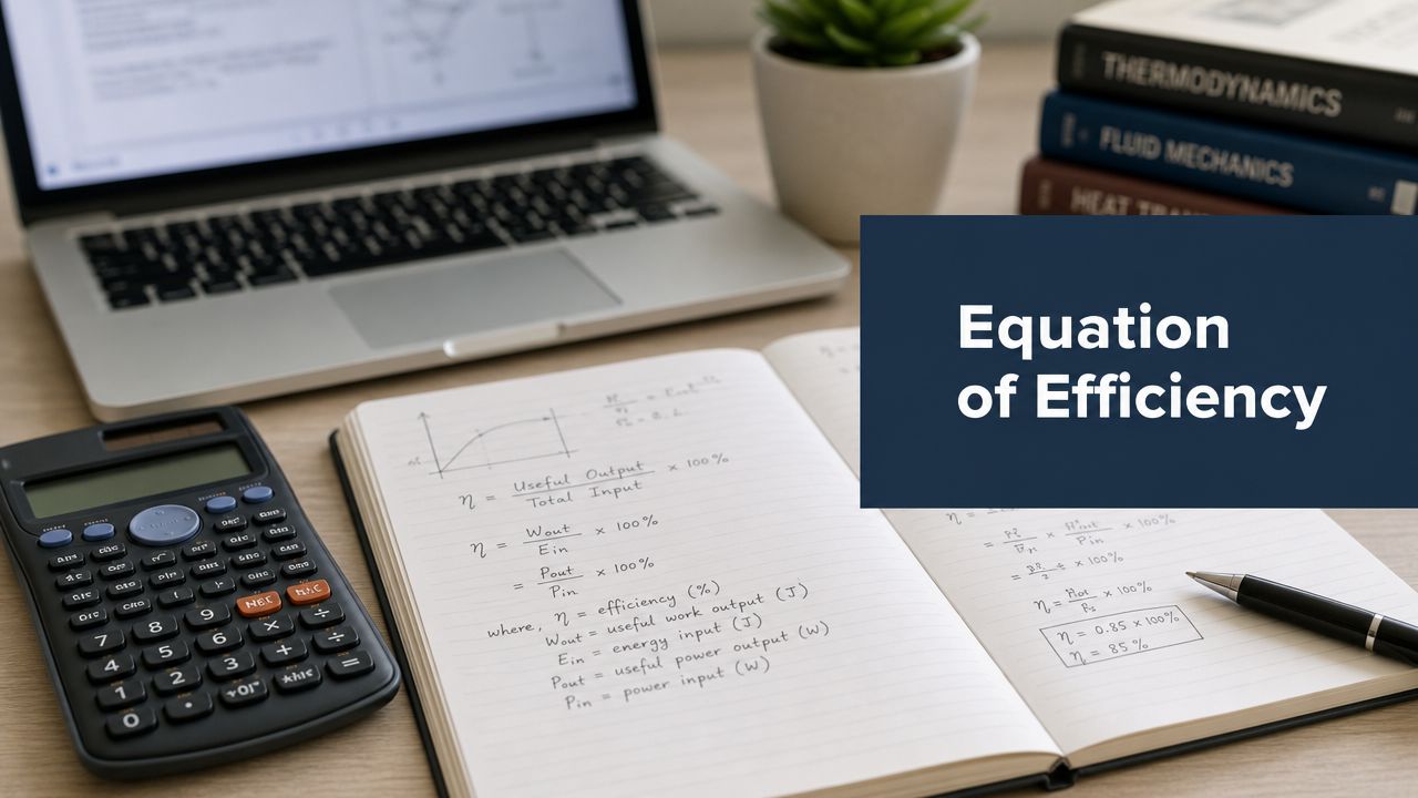
In engineering terms, efficiency is commonly expressed as:
Efficiency (%) = (Output Power ÷ Input Power) × 100
That's the version most operators recognise. If a system takes in power and only part of it becomes the output you care about, the rest is loss. Usually that loss appears as heat, friction, conversion overhead, resistance, or standby consumption.
The important operational point is this: losses are part of the system, not an accounting footnote.
Take three settings:
- Heat engine: fuel goes in, motion comes out, and a portion leaves as waste heat.
- Solar installation: sunlight hits the panel, electrical output comes out, while angle, reflectance, and other conditions reduce delivered energy.
- Data centre: electrical power comes in, compute work comes out, while cooling, power distribution, and standby systems consume a share of the total.
Why operators care about losses
Output is typically prioritized first because it's visible. Losses are where the better decisions sit.
A plant engineer looks at motor heat and pump curves. A facilities team looks at cooling overhead. A digital infrastructure lead looks at the gap between power entering the building and power reaching IT equipment.
That's why data centre teams often use PUE instead of the simple output/input percentage. The IEA 4E guidance described in the data-centre efficiency metrics study treats PUE as a practical facility metric. Because PUE compares total facility power to IT equipment power, a lower PUE means less overhead from cooling, distribution losses, and standby loads. The same guidance also notes that efficiency should be assessed across utilisation levels, not just at peak load.
A server room can look tidy on a slide deck and still waste energy all week because the operating profile is wrong.
The unit matters less than the boundary
In physics, you might talk in joules or watts. For leadership decisions, the unit is less important than the system boundary.
If your boundary is too narrow, efficiency looks better than it is. That happens all the time in digital operations. Teams count compute output and ignore cooling. They count staff hours and ignore waiting time. They count software licences purchased and ignore whether anyone uses them.
A useful efficiency equation forces a complete boundary. It makes you include the expensive mess around the core process.
How Statisticians Measure Wasted Effort
Efficiency in statistics sounds abstract until you translate it into operations language. It's about how much uncertainty remains after you've used the information available to you. A method that gets to a stable answer with less variance is wasting less information.

The formal definition
A standard statistical definition is:
e(T) = [1 / I(θ)] / var(T)
In that equation, I(θ) is Fisher information, and 1 / I(θ) is the Cramér–Rao lower bound. By that definition, efficiency cannot exceed 1, and an estimator with efficiency 1.0 (100%) exactly reaches the bound. That summary appears in the efficiency in statistics reference).
The reason this matters is practical. It turns “efficient” into something measurable. Not “I like this method” or “this result feels stable”, but a comparison between actual variance and the best variance theoretically allowed.
A plain-language analogy
Suppose you're trying to identify a hidden number. One approach is random guessing. Another is asking questions that cut uncertainty sharply, such as whether the number is higher or lower than a midpoint.
Both approaches use effort. One wastes much less of it.
That's the bridge to operational measurement. In statistics, variance is a form of waste. If two methods use the same data but one produces noisier estimates, that method is less efficient. It consumes information badly.
What that means outside statistics
This idea is useful for leadership teams because it reframes noisy management metrics. If your productivity dashboard swings wildly every week because the measure is badly defined, the problem may not be the team. The problem may be the estimator.
Here's the practical test:
- Stable enough to guide action: keep it
- Sensitive to random fluctuations: refine it
- Easy to game: replace it
- Disconnected from value: ignore it
Efficient measurement wastes less information. That applies to analytics programmes just as much as to statistical estimators.
A lot of reporting in knowledge work fails this test. It produces numbers, but with so much noise and distortion that the organisation can't tell signal from theatre.
Translating Efficiency to Knowledge Work
Knowledge work inherits the logic of physics, but not the clean measurability. The output isn't always physical. The input isn't just time. And the losses are often hidden in calendars, app switching, waiting for reviews, and fragmented attention.

Stop treating hours as the whole input
In digital teams, leaders often default to hours worked because hours are easy to log. That's usually too blunt to be useful.
For a developer, two hours of uninterrupted coding and two hours split across chat, ticket triage, and meetings are not equivalent inputs. For a product manager, a day spent resolving ambiguity may produce more value than a day spent closing admin tasks. For a designer, rework caused by poor handoff is lost capacity, even if everyone looked busy.
The better translation is:
| Physical system | Knowledge work equivalent |
|---|---|
| Useful output | Shipped feature, approved design, resolved incident, accepted change |
| Total input | Time, focus, software cost, review effort, cognitive load |
| Losses | Interruptions, rework, waiting, duplicated work, app friction |
Efficiency is a profile, not a score
One of the biggest mistakes I see is trying to compress a week of digital work into one static figure. That misses how work quality changes with conditions.
The better question is often the one stated in the discussion of time-varying efficiency under changing conditions: not “what is the efficiency?” but “what is the efficiency profile across the conditions we operate in?” In knowledge work, that means looking at meeting-heavy days, interruption-heavy periods, deep-work blocks, release windows, and support rotations separately.
A short video can help frame that shift in mindset:
What works in practice
I'd rather see a leadership team compare conditions than rank people.
For example:
- A support squad during incident weeks will have a different efficiency profile from a feature squad in build mode.
- A meeting-dense Tuesday may show lower useful output per unit of focus than a protected workday.
- A tool migration may temporarily reduce output while increasing long-term efficiency.
If your managers need help turning those patterns into coaching rather than control, a structured coaching platform can help conversations stay focused on work design, habits, and constraints instead of personal blame. For a more specific view on tracking effort without reducing work to busyness, this piece on the art of effort tracking is worth reading.
Choosing Your Inputs and Outputs
The equation of efficiency for digital work fails when inputs and outputs are chosen lazily. “Tasks per hour” sounds tidy. It usually rewards small tasks, rushed handoffs, and work that creates more work later.
Inputs worth measuring
Inputs should describe the resources consumed to produce value. For digital teams, that usually includes more than labour time.
A practical menu:
Focus time
Blocks of uninterrupted work in core applications. This is often the closest operational proxy for usable cognitive capacity.Context switching frequency
How often people bounce between applications, windows, or task types. High switching isn't always bad, but persistent switching usually points to fragmented work.Application utilisation
Time spent in high-value tools versus admin-heavy or low-value software. This is useful for both workflow design and licence reviews.Review and coordination effort
Time consumed by approvals, handoffs, and status reporting. In some teams this is the hidden input eating the week.
Outputs that say something real
Outputs need to reflect delivered value, not just visible activity.
Consider these:
- Throughput, such as merged pull requests, completed changes, approved designs, or resolved tickets with clear business relevance.
- Cycle time, measured from start to completion for a unit of work.
- Rework rate, which acts as a quality signal. If apparent throughput rises while rework rises too, efficiency usually hasn't improved.
- Adoption or usage outcomes for internal tools, where the work is only useful if people use what was delivered.
Don't ask for a universal metric. Ask for a defensible set of proxies that fit the team's work.
Pair the metrics properly
Bad pairings create nonsense. Good pairings show trade-offs.
Here are examples:
| Input | Output | What it reveals |
|---|---|---|
| Focus time | Throughput | Whether protected work time turns into delivered work |
| Context switching | Cycle time | Whether fragmentation is slowing completion |
| Application utilisation | Adoption outcome | Whether software spend maps to actual use |
| Review effort | Rework rate | Whether quality is being built in or inspected late |
The best equations are boring. They survive scrutiny. They can be explained in one meeting without hand-waving.
Measuring Digital Work Without Violating Privacy
Often, efficiency programmes fail because leaders want better measurement, then reach for surveillance. Screen recording, keystroke logging, and constant observation poison trust fast, and they usually produce bad management behaviour to match.
The legal and operational boundary
In privacy-sensitive workplace analytics, the classic Efficiency = Output ÷ Input is easy to write down and hard to operationalise responsibly. EU-facing guidance stresses data minimisation under GDPR, and in the Netherlands the Autoriteit Persoonsgegevens has repeatedly warned that continuous monitoring must be necessary and proportionate, as noted in this discussion of efficiency measurement and privacy.
That principle has a practical consequence. If you can answer the management question with metadata, you shouldn't collect content.
What privacy-safe telemetry looks like
Privacy-safe measurement usually focuses on patterns such as:
- Application usage metadata instead of screen content
- Time in categories of tools instead of message text
- Counts of switches or sessions instead of detailed behavioural reconstruction
- Aggregated team views instead of constant individual inspection
That's enough to answer useful questions.
Which tools are heavily used? Which licences appear idle? When are people getting long focus blocks? Which workflows create repeated switching? Has a process change reduced interruption or just moved it around?
A practical reference on this approach is the piece on data transparency and work pattern optimisation, which lays out how organisations can use telemetry to study work patterns without drifting into content capture.
What to avoid
Some signals should raise immediate concern:
- Keystroke order capture
- Screen video
- Always-on individual ranking
- Monitoring with no stated decision use
- Collecting data because it might be useful later
Those patterns produce what I'd call efficiency theatre. There's lots of data, lots of dashboards, and very little operational improvement.
The better use of measurement
Used well, digital telemetry is diagnostic. It helps you find friction in the system.
For example, a team might discover that engineers spend more time than expected moving between issue tracking, documentation, chat, and CI tooling. That finding doesn't require reading anyone's messages or watching their screen. It points to integration gaps, review queue design, or meeting load.
If you need one concrete product example, WhatPulse Professional is built around that narrower model. It aggregates application usage, keyboard and mouse activity, and network traffic across Windows and macOS endpoints without capturing content or keystroke order, which makes it usable for focus time, adoption, and bottleneck analysis in a GDPR-conscious environment.
An Actionable Framework for Improving Efficiency
Most efficiency work becomes political because people treat it as judgment. It works better as a controlled improvement loop.

A four-step operating loop
Define value
Start with one team. Pick outputs that matter. For engineering, that might be accepted changes, stable releases, or incident resolution. For IT operations, it might be completed deployments, reduced tool sprawl, or cleaner adoption of a new platform.Measure input
Choose a small set of inputs. Focus time, switching, coordination overhead, and tool usage are usually enough to start. If you need a concrete process for turning usage data into management decisions, this guide on moving from data to decisions is a solid reference.Analyse the process
Look for one source of friction. Too many meetings. Excessive review loops. High app switching. Low usage of expensive software. If your team needs a practical outside read on how to diagnose workflow bottlenecks, that framework is useful because it stays close to process issues rather than personality judgements.Optimise and iterate
Run one change at a time. Protect a morning for deep work. Merge two approval steps. Retire a duplicate tool. Then compare the new pattern with the baseline.
Small experiments beat broad efficiency programmes. They create less fear and better evidence.
What good practice looks like
Keep the cycle tight:
- One team first
- One hypothesis at a time
- One decision owner
- One review cadence
Don't try to prove that everyone is efficient. Try to learn which conditions produce better work with less waste.
That's the useful meaning of the equation of efficiency. It isn't a vanity percentage. It's a way to define value, expose losses, and make better operational choices.
If you want to measure digital work without content capture, WhatPulse gives teams a privacy-first way to study application usage, focus patterns, software adoption, and workflow friction across their computers. It's a practical fit for leaders who want evidence for process changes without turning measurement into surveillance.
Start a free trial