
You can feel the tension before the pilot even starts.
An IT lead wants better visibility into software usage across a hybrid team. Finance wants to know which licences are sitting idle. Engineering managers want a cleaner picture of focus time, meeting load, and tool switching. HR and legal hear the word “monitoring” and immediately think screenshots, keystroke logging, and employee complaints.
That tension is reasonable. Most organisations do need better work-pattern data. They also need to avoid turning endpoint analytics into a trust problem.
The useful way to think about productivity monitoring tools is this: you're not trying to watch people. You're trying to answer operational questions that are hard to answer by instinct alone. Which applications are heavily used? Which ones are barely touched? Where do teams lose focus? Which processes create constant context switching? Which devices or departments need support, not pressure?
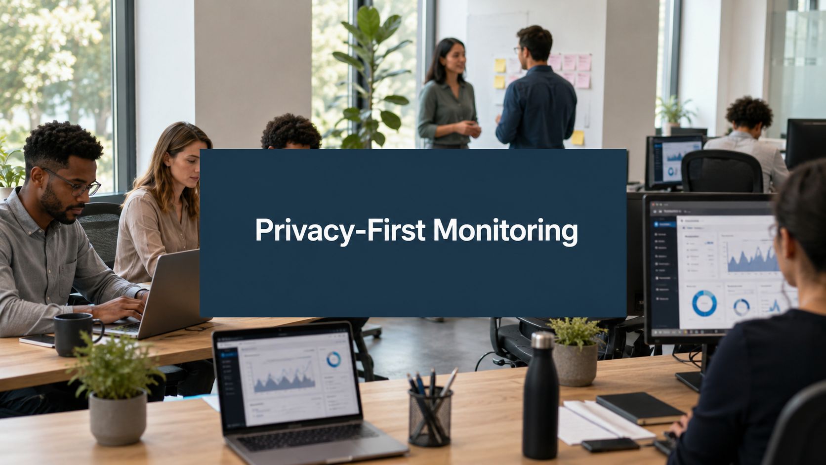
The mistake is treating every monitoring tool as if it does the same thing. Some products are built like surveillance software. Others are built like telemetry systems for work patterns. That difference decides whether a rollout helps the business or backfires with employees.
A good starting point is to frame the project around transparency and work-pattern insight, not control. This practical note on optimising work patterns with data transparency gets at the core issue well. Teams usually accept measurement more readily when they can see what's being collected, why it's being collected, and what won't be collected.
The Search for Productivity Data Without Big Brother
A familiar situation looks like this. Your company has moved into a stable hybrid routine. People are productive, but nobody can say with confidence where time goes. Procurement suspects overlap across SaaS tools. Managers think meetings are eating into delivery time. Support teams say some workflows are clunky, but they can't prove it.
Without data, people fill the gap with opinion. Usually loud opinion.
The operational need is real
Teams don't typically buy productivity monitoring tools because they want to watch every click. They buy them because they're trying to solve ordinary operating problems:
- Software waste: You need to know which applications are widely adopted and which licences can be reduced.
- Workflow friction: You want evidence of excessive app switching, idle windows, or tools that slow work down.
- Hybrid visibility: You can't use physical presence as a proxy for output anymore, so you need other signals.
- Support planning: You need to spot where teams are overloaded by process, not just where individuals look busy.
That's a valid business case. In operations, guessing is expensive.
The backlash risk is also real
Employees usually don't object to all analytics. They object to hidden collection, vague purpose, or tools that feel designed for suspicion. Once people think a system is there to catch them out, the rollout is damaged before the dashboard loads.
Practical rule: If you'd be uncomfortable reading the data policy aloud in an all-hands meeting, the setup is probably too invasive.
Leaders often err. They focus on feature depth first, and governance later. In practice, the order should be reversed. Decide what question you need answered. Then decide the least invasive data required to answer it.
That approach changes the shortlist quickly. Screenshot capture starts to look unnecessary. Continuous screen recording looks worse. Metadata starts to look a lot more useful.
What Productivity Monitoring Tools Really Are
The term covers two very different product categories, and mixing them up causes most of the confusion.

Analytics tools versus surveillance tools
A privacy-first productivity tool works more like a building sensor system than a camera network. It tells you which rooms are in use, when activity peaks, and where resources are underused. It does not record every conversation in the corridor.
That distinction matters. The lower-risk class of tools usually focuses on metadata such as:
- Application usage: which apps are open and active
- Active versus idle time: whether a device is being used
- Website usage: domains or pages visited, depending on settings
- Device activity patterns: work rhythms over the day
- Aggregated trends: team-wide views rather than replaying a person's day
Older or more intrusive products move into content capture. That includes screenshots, full keystroke logging, message content, or continuous screen video. Those features create a very different legal and cultural burden.
What modern teams actually need
In most organisations, the useful questions are surprisingly ordinary.
Do developers spend half the day in an IDE, or are they bouncing between chat, tickets, and browser tabs? Is a design team really using the premium creative suite you're paying for? Did a process change reduce tool switching? Are people getting interrupted constantly?
You can answer a lot of that with app names, time signals, and activity metadata. You don't need to know what someone typed into a private message to learn that meetings are breaking up focus blocks.
Good monitoring gives you patterns. Bad monitoring gives you voyeurism.
The dashboard should support decisions
The best productivity monitoring tools don't produce a dossier on each employee. They produce a dashboard that helps IT, operations, and managers make decisions.
That usually means:
| Tool behaviour | What it supports |
|---|---|
| App and web usage summaries | Licence reviews and adoption checks |
| Active time and idle time trends | Workflow analysis and focus planning |
| Team-level reports | Capacity and process reviews |
| Central policy settings | Consistent rollout across endpoints |
A product like WhatPulse fits the analytics side of this category. It tracks application usage, keyboard and mouse activity, and network traffic as telemetry, rather than capturing content, and exposes those patterns in dashboards employees and admins can review.
That doesn't make every deployment sensible. It just means the product model starts in the right place.
The Data These Tools Actually Collect
Most buying mistakes happen here. A vendor demo can make everything look harmless because all the graphs are neat and abstract. The key question isn't how polished the dashboard is. It's what raw data had to be collected to produce it.

Low-impact data that still gives useful insight
In the Netherlands and similar GDPR-heavy environments, the practical benchmark leans towards activity, time, and application-usage signals rather than content capture, with non-invasive tools measuring active time, app usage, and metadata-based productivity scoring while avoiding screenshots, keystroke content, and screen recordings, which lowers GDPR risk (privacy-respecting monitoring benchmarks).
That low-impact group usually includes:
- Application names and usage time: enough to see adoption and workflow mix
- Active and idle time: enough to estimate focus blocks and interruption patterns
- Keyboard and mouse activity rates: enough to detect engagement levels without recording what was typed
- Network traffic volume: enough for understanding system usage and, sometimes, troubleshooting broad patterns
This type of data is often enough for IT operations, software asset management, and team workflow reviews.
Medium-impact data that needs tighter controls
Some data types sit in a middle zone. They may be useful, but they need stricter purpose limits and tighter access control.
Examples include:
- Detailed URL tracking: useful for category analysis, but often sensitive
- Location or office presence signals: relevant in some field or security cases
- Communication metadata: meeting duration or email volume, without message content
These aren't automatically wrong. But they need a hard test: what exact decision will this data support?
High-impact data that usually causes more trouble than value
At this point many programmes go off the rails.
- Keystroke content logging
- Screenshot capture
- Screen recording
- Email or chat content capture
These features create the highest privacy burden and, in many office settings, the weakest operational case. They also produce data that managers tend to misuse because it looks rich and “objective” even when it isn't.
If your goal is to understand work patterns, collecting content is usually a sign that the scope has drifted.
When comparing vendors, I'd ask for the actual collection model in plain language. Not marketing language. A useful reference point is this WhatPulse privacy and data collected FAQ, which spells out what telemetry is gathered and what isn't.
If a vendor can't answer clearly whether they store keystroke order, screenshots, or message content, stop the evaluation there.
Why Businesses Use Productivity Monitoring Data
The data only matters if it answers a business question. Otherwise you're just collecting telemetry because the software can.

Licence and tool spend
The most obvious use case sits with IT and finance. Application usage data helps answer basic questions that procurement teams wrestle with every renewal cycle.
Which paid tools are in active use? Which departments rely on them daily? Which products overlap? Which “critical” licences haven't been opened in months?
That's not a surveillance question. It's a cost and adoption question.
You don't need screenshots to make that call. You need a reliable view of app usage, active time, and maybe version distribution if you're also managing rollouts.
Hybrid work without attendance theatre
The Dutch market has leaned heavily into hybrid work. Recent guidance notes that the labour market's focus on hybrid work has raised demand for tools that measure focus time and application usage, with Dutch organisations using endpoint analytics to manage distributed teams, benchmark performance, and identify bottlenecks while respecting privacy (hybrid work productivity metrics).
That shift changes what managers need to see. Presence in the office tells you less than it used to. Teams need ways to understand work patterns across locations without sliding into invasive oversight.
That usually means looking for signals such as:
- Focus windows: when uninterrupted work is underway
- Meeting load: whether collaboration tools dominate the day
- Tool switching: whether work gets fragmented by process
- Baseline comparisons: whether a team's work pattern changes after a reorganisation or tool rollout
Workflow improvement
This is the use case I find most underrated.
A dashboard can show that a team spends a huge chunk of its day moving between a ticketing system, chat, browser tabs, and a project board. That doesn't tell you anyone is lazy. It tells you the process may be broken.
Sometimes the right response is a tooling change. Sometimes it's fewer status meetings. Sometimes it's clearer handoffs or better documentation.
If you're working on improving staff productivity, the most useful gains often come from reducing friction in the system rather than pressing individuals harder. Usage data helps you see that friction where opinions usually dominate.
Teams rarely need more pressure. They often need fewer interruptions, fewer overlapping tools, and fewer bad assumptions about how work gets done.
Navigating Privacy Risks and GDPR Compliance
This is the part many guides rush through. They shouldn't.
In the Netherlands, employee data processing sits under strict GDPR and UAVG rules, and the Dutch Data Protection Authority expects employers to justify monitoring with a concrete purpose and avoid intrusive measures. Since GDPR became enforceable on 25 May 2018, privacy-first design, EU-based storage, and deletion rights have become operational requirements rather than nice extras (Dutch monitoring and GDPR context).
Start with purpose, not tooling

If your internal brief says “collect everything now, decide use cases later”, that brief is broken.
A lawful rollout needs a narrow purpose that people can understand. Examples might include:
- Software asset management
- Understanding tool adoption after a migration
- Reviewing workflow bottlenecks in hybrid teams
- Supporting endpoint governance with central policy control
What usually fails the test is blanket collection justified by vague phrases like “performance optimisation” or “better oversight”.
A concrete purpose forces discipline. It limits data fields. It narrows who can access the data. It shapes retention periods. It also makes employee communication far easier.
For a more grounded discussion of the trade-offs, this piece on employee tracking ethics and the privacy-productivity balance is worth reading alongside your legal review.
Dutch practice is stricter than many buyers expect
The formal rulebook matters. So does local expectation.
In the Netherlands, the technical setup can still fail if the organisational setup is poor. A tool may support minimised data collection, but the programme will still run into trouble if HR, legal, IT, and employee representatives aren't aligned on use, access, and retention.
This is where works council consultation, internal notices, and role-based access matter. If team leads can browse raw employee-level data without a tightly defined purpose, the deployment is already risky.
A sensible control model usually includes:
- Defined access roles: IT, operations, and managers shouldn't all see the same level of detail
- Retention rules: keep data only as long as the stated purpose requires
- Deletion capability: if the tool makes deletion difficult, treat that as a product problem
- Employee visibility: where possible, employees should be able to see what the system records about their own activity
This WhatPulse privacy policy is a useful example of the kind of transparency buyers should expect when assessing a vendor.
A practical explainer can help internal teams get aligned before procurement signs anything.
Privacy-first design is the deployment strategy
Privacy isn't separate from implementation. It is the implementation strategy.
If employees understand the purpose, can see the scope, and believe the data won't be used as a hidden disciplinary tool, adoption becomes manageable. If they don't, even a technically compliant deployment will create resistance.
Monitoring that employees can understand is easier to govern than monitoring that needs constant internal reassurance.
An Evaluation Checklist for Choosing a Tool
Most vendor comparisons spend too much time on dashboard screenshots and too little on collection method.
That's backwards. A polished dashboard doesn't compensate for a bad data model.
Guidance for these platforms usually points buyers towards real-time dashboards, automated reporting, and centralised policy control, especially for hybrid teams and endpoint governance, while the key trade-off is whether telemetry is detailed enough for licence optimisation and process analysis without becoming intrusive (platform evaluation guidance).
The questions that matter most
Use a checklist that forces clear answers. If a vendor can't answer these in writing, move on.
| Category | Evaluation Question | Why It Matters |
|---|---|---|
| Data collection | Does the tool capture metadata only, or does it record content such as screenshots or keystroke text? | This is the core privacy and trust distinction. |
| Keystroke handling | Can the vendor confirm that keystroke order or typed content is not stored? | “Keyboard activity” and “keylogging” are not the same thing. |
| Screen capture | Are screenshots, screen video, or OCR features enabled by default, optional, or absent? | Optional invasive features often become future governance problems. |
| Application insight | Can the product report application usage clearly enough for adoption and licence reviews? | Many organisations buy these tools for software visibility first. |
| Web tracking | How detailed is website monitoring, and can it be limited by policy? | URL-level data can become more sensitive than buyers expect. |
| Access control | Who can see individual data, and can permissions be restricted by role? | Managers should not automatically get broad visibility. |
| Employee transparency | Can employees view their own recorded activity? | Visibility reduces suspicion and cuts down misunderstanding. |
| Data location | Where is the data stored? | Residency and transfer questions matter immediately in EU deployments. |
| Deletion rights | Can data be deleted on request or by retention rule? | If deletion is hard, compliance becomes operationally messy. |
| Retention settings | Can retention be configured by policy? | Shorter retention often lowers risk. |
| Reporting | Does the tool provide exportable reports for IT, finance, and operations? | Dashboards are useful, but exported data often supports the real decisions. |
| Policy control | Can admins manage settings centrally across devices? | Consistency matters when you're rolling out across many endpoints. |
A fast way to filter weak vendors
Ask these three questions early:
- What exact data do you collect?
- What exact data do you never collect?
- Can you show how an employee would see their own data?
Weak vendors answer with broad reassurance. Strong vendors answer with product specifics.
That usually tells you more than the sales deck.
Deployment Best Practices and Sample Policies
Good deployments are built in the announcement, not in the installer.
The main failure pattern is secrecy followed by over-explanation after employees discover the software. By then, trust has already taken a hit. In the Netherlands, that mistake is worse because the compliance question often isn't “does the tool have privacy features?” but whether HR and legal can operationalise it for works council review, employee notices, and GDPR necessity tests. That gap is one reason “Can we monitor this in the Netherlands?” remains poorly answered in practice (Dutch compliance gap in monitoring).
What works in a rollout
The cleanest rollouts usually share the same traits:
- Name the purpose plainly: say “we're reviewing software usage and workflow bottlenecks” instead of “we're deploying productivity tooling”.
- State the limits: explain what is not collected. Employees remember exclusions.
- Restrict the audience: say who can view what, and for which purpose.
- Show the retention rule: indefinite storage makes people nervous, and for good reason.
- Invite questions early: concerns raised before deployment are easier to handle than rumours after deployment.
“We use this system to understand application usage, activity patterns, and workflow bottlenecks across company devices. We do not use it to capture message content, screenshots, or keystroke text. Access is limited by role, and data is reviewed for operational planning, software management, and process improvement.”
That sort of language works because it is specific.
A sample internal policy statement
You can adapt this for a handbook, works council pack, or internal notice:
- Purpose of collection: The company collects limited device and application telemetry to support software asset management, endpoint operations, and analysis of workflow patterns in hybrid work.
- Data in scope: This may include application usage, active and idle time, device activity signals, and related metadata.
- Data out of scope: The company does not use this system to capture the content of emails, chats, typed text, screenshots, or screen recordings.
- Access and review: Access is limited to authorised roles based on business need.
- Retention and deletion: Data is retained according to documented policy and deleted when no longer required for the stated purpose.
- Employee transparency: Employees are informed about the system, its purpose, and their rights in relation to the data.
Most resistance drops when the organisation sounds like it has thought this through, because it has.
If you need a privacy-first way to understand application usage, activity patterns, and software adoption across company devices, WhatPulse is built for that operating model. It gives IT and operations teams real-time visibility into work patterns without capturing content, stores data in the EU, and supports the kind of transparent rollout that stands up better in high-privacy environments.
Start a free trial