Hi there,
We've just released WhatPulse v6.2! The headline additions are word counting, an end-user pause toggle for transparent data collection, and proxy configuration built right into the login wizard, a frequent request from teams behind corporate networks. Beyond that, there's a range of UI improvements and bug fixes.
Details below:
Word counting: a new output metric for your dashboards
WhatPulse now tracks how many words each person types, without ever storing the text itself. Word counts are inferred locally from keystroke patterns: word boundaries are detected from key events (spaces, punctuation, enter, etc.), corrections like backspace and delete are accounted for, and IME input methods are supported. Only the numeric counts ever leave the machine.
For organizations, this adds a new dimension of activity data alongside keystrokes, clicks, application time, and bandwidth. Word counts roll up per user and per application, so you can see typing-heavy work across teams and roles without compromising privacy — the content is never captured, only the count.
Word counting is on by default and respects your existing keyboard and per-application tracking settings, so it honors whatever boundaries you've already configured for your organization.
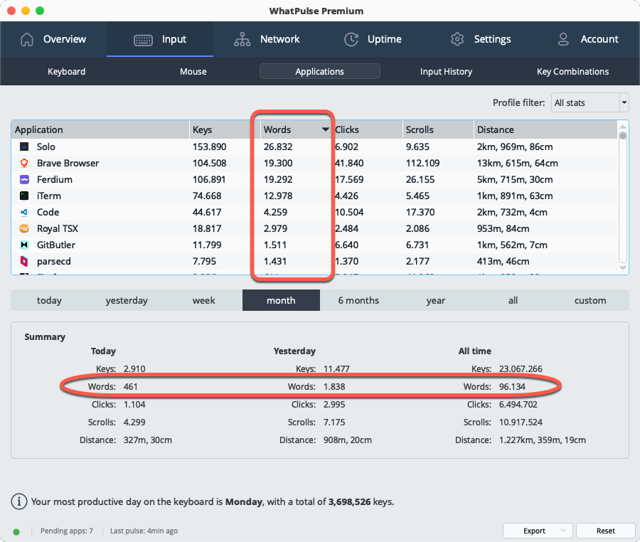
The word count metric is available in the desktop app, but also flows into your WhatPulse Professional dashboards. It's in your dashboards, data views, reports, and exports alongside the other metrics, so you can analyze it in combination with keystrokes, application time, and more. For teams looking to understand typing-heavy work or simply add another dimension to their activity insights, word counting is a powerful new tool.
A pause toggle for transparent data collection
Transparency and trust are central to deploying activity tracking across a team. The new pause toggle in the tray popup lets a user stop collection on their own machine at any time — for a benchmark, a stress test, a colleague borrowing the keyboard, or simply a personal moment.
While paused, it's unmistakable: the status bar pill turns orange with an explanatory tooltip, the overview tab shows an amber banner with a one-click "Resume collecting" button, and the stats grid grays out behind an overlay. Activity during a pause is dropped rather than buffered, so resuming never retroactively logs the paused period. The pause is intentionally runtime-only and resets when the client restarts — a clear, honest control that helps your team feel comfortable with always-on insights.
This one is for the IT departments. Computers behind a corporate proxy can now be configured before they ever authenticate. A new "Configure proxy..." button on the login and activation pages opens a dedicated proxy dialog, so first-time activation no longer requires reaching the Settings tab (which only becomes available after login).
For organizations rolling out the client at scale across managed networks, this removes a common snag in the deployment and activation flow.
This doesn't apply to environments where the proxy was centrally managed by the settings overrides.
Redesigned input history page
The input history page in the client has been rebuilt with a cleaner look and better usability for end users reviewing their own activity:
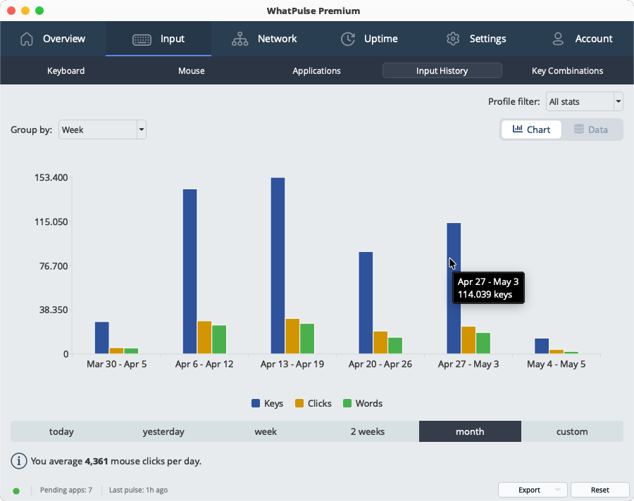
- Grouped bar chart with interactive legend: Click series in the legend to show/hide them. Hidden series free up bar width for the remaining ones, and legend preferences are remembered across sessions.
- Flexible time periods: The fixed period dropdowns are replaced with the same time period selector used on the uptime page — today through all-time, plus custom date ranges.
- Group by hour, day, week, month or year: A new group-by control zooms in or out on typing and clicking trends, with a sensible default chosen automatically for the selected period.
Smaller UI improvements
- Status bar actions: Reset and Export buttons have moved from individual tab pages into the shared status bar at the bottom. They update based on the active page, freeing up vertical space and making the reset button less likely to be clicked by accident.
- New animated toggle: A polished animated pill toggle replaces the previous mix of buttons and dropdowns for switching between chart and data views, for a more consistent look across the app.
Fixed
- Fixed proxy settings not persisting between sessions; changes made in Settings > Proxy now save correctly and apply immediately without a restart.
- Windows: Fixed a high CPU usage issue that could occur on startup when running as administrator.
- Windows: Fixed mouse heatmap clustering on displays with DPI scaling, where clicks in the right and bottom portions of the screen were dropped or misattributed to the wrong monitor.
- Windows: Improved detection of application version information, especially for games and smaller tools that don't include full version metadata.
- Fixed the application sync window sorting by "last used" — it was sorting alphabetically on the text (e.g. "22 hours" before "3 days") instead of by actual date.
- Fixed being able to open the FAQ window by clicking on empty space in the row instead of the actual text.
How to update
Clients can upgrade via the "Check for Updates" option inside the app (if updates are enabled), or by deploying the latest build from the Downloads page through your usual management tooling. Once updated, the new data flows straight into your WhatPulse Professional dashboards.
Thanks for being part of the WhatPulse Professional community — plenty more on the way.
— Martijn & the WhatPulse team